The process for allowing organizations to securely create and manage certificates to digitally sign software via a Code Signing Certificate enrollment process within SCM (Sectigo Certificate Manager) is provided in this guide. This guide tells about the entire enrollment process from the point of completing certificate profile creation and certificate submission. Prerequisites Before beginning enrollment,… Read More How to Enroll a Code Signing Certificate in Sectigo Certificate Manager?
Learn how to block bots and stop bot attacks on your website, app, and APIs. From basic techniques to advanced AI-powered bot management, we cover what works, what doesn’t, and why.
Learn how to clean up Active Directory before enabling SAML-based SSO to ensure secure authentication, accurate user mapping, and smooth identity integration.
Join Bellingcat’s WhatsApp Channel for the latest news and resources from us.
How does one monitor a conflict zone on the brink of civil war, especially in a region which is difficult to access, experiences frequent internet shutdowns and where misinformation is common? In this guide, we outline the open source tools and methods we can use to evidence what is really happening in many such conflict settings.
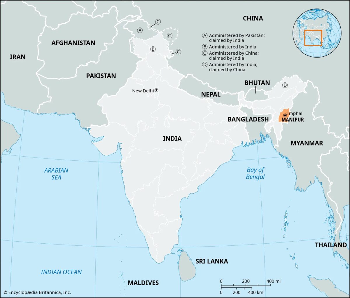
Our focus for this guide is on India, which recorded 84 internet shutdowns in 2024 – the highest number amongst democratic nations. In early June, authorities imposed a curfew and suspended internet access in parts of Manipur after protests erupted over the arrest of ethnic leaders. The state, in the north-east of the country, has been wracked by violence for years.
Map of Manipur, Northeast India (Source: Encyclopedia Britannica)
The ethnic conflict between the majority, mostly Hindu Meitei population and the indigenous, largely Christian Kuki Zo communities is one of the worst spates of violence Manipur, also known as the “Land of Jewels”, has experienced in decades.
The Imphal valley in Manipur is surrounded by mountains. It is home to 39 ethnic communities. Just over half of its nearly three million residents belong to the Meitei community, followed by the Naga (20 percent) and the Kuki Zo (16 percent) tribes.
The landscape is complex, with ethnic armed groups divided into multiple factions (this list is not complete):
The ethno-nationalist militia – yet to be designated as a banned group – Arambai Tenggol (AT), the United National Liberation Front (UNLF) – Meitei
Kuki National Army, Kuki National Front – Kuki
Zomi Revolutionary Army – Zomi
National Socialist Council of Nagalim (Isak Muivah) – Naga
In May 2023, the Manipur High Court passed an order recommending a Scheduled Tribe status (a category for indigenous communities in India that guarantees affirmative action and constitutional protection over identity and land) for the dominant Meitei community. Tribal communities rallied against the decision while the Meitei community held counter-rallies and counter-blockades. Clashes broke out between the Kuki and Meitei groups. Since then, the conflict has displaced more than 60,000 people and claimed more than 260 lives from both communities.
In this guide, we show you how to use open source methods in any secluded area to:
Analyse weapon imagery and the groups using them
Investigate weapons that were looted and where they ended up
Analyse images of drones potentially used as weapons to deploy munitions
Analysing Weapon Imagery
One effective approach for open source researchers is to trace the digital footprint of weapons. In the Manipur case, local armed groups, such as the Arambai Tenggol, the UNLF and the Kuki National Front, have been posting weapon imagery mainly in WhatsApp groups and Facebook accounts.
Support Bellingcat
Your donations directly contribute to our ability to publish groundbreaking investigations and uncover wrongdoing around the world.
According to media reports, the war has been fueled by weaponry looted from police armouries or procured on the black market either from Myanmar, across the border, or through surrenders in amnesty drives.
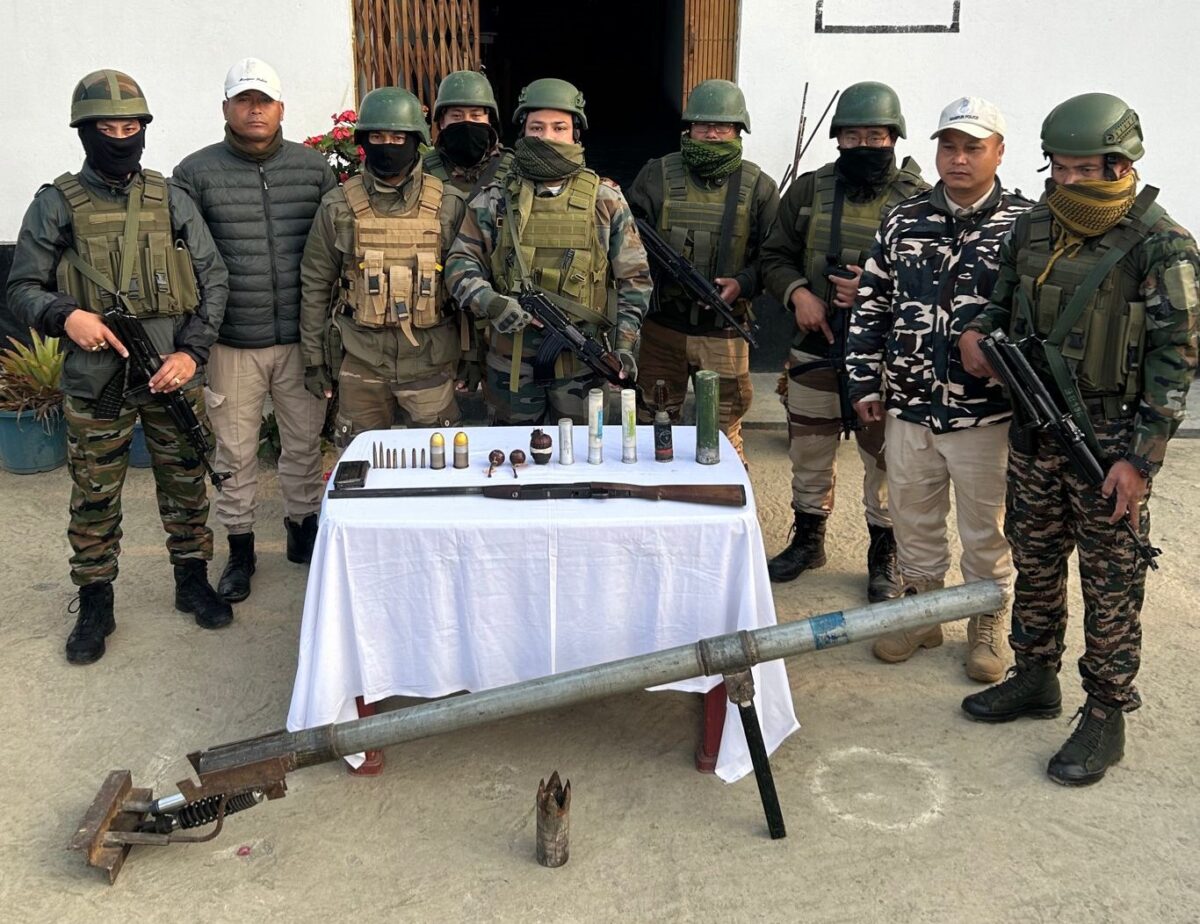
The 6,000 firearms looted included pump-action shotguns, grenade launchers, AK-pattern rifles, INSAS rifles and ammunition. The police claimed that in February and March alone, more than 1,000 weapons were surrendered, with more than half from the Meitei-dominated valley districts, where a majority of the weapons were looted.
Bellingcat analysed weapon imagery from 2023 and 2024, accessed from WhatsApp groups and Facebook accounts linked to non-state actors, including the AT, Kuki Zo militant groups, and various volunteer organisations. While these groups have surrendered some weapons in amnesty drives, many sophisticated weapons were not turned in and were only recovered in search operations by security forces.
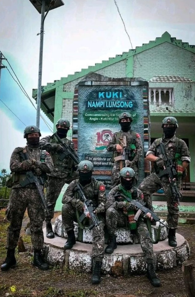
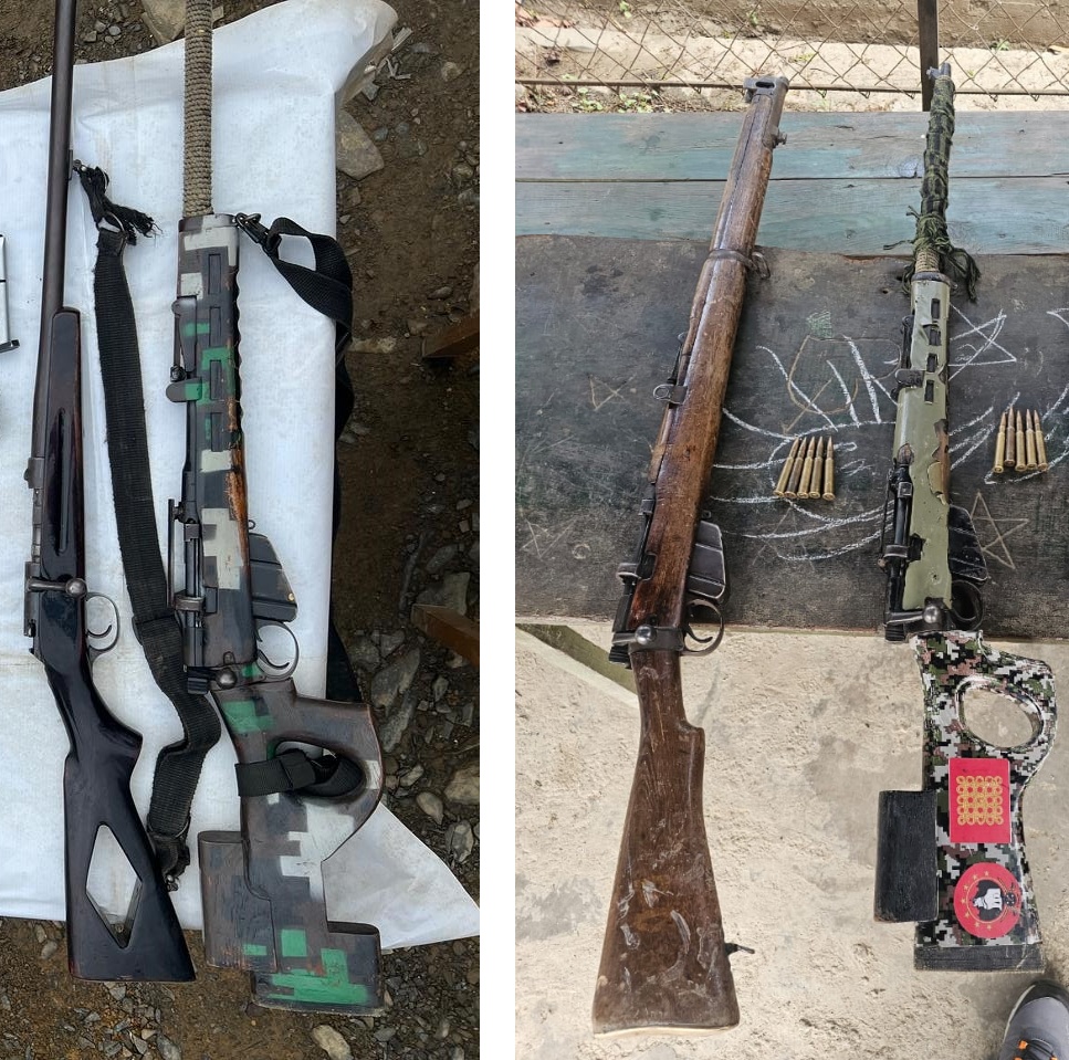
A photo posted to Facebook shows members of The Kuki National Front posing with a number of weapons.
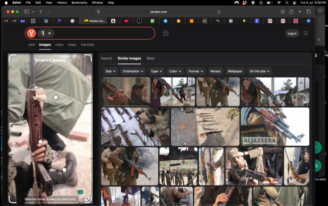
For verification, we ran screenshots of images of the weapons without visible serial numbers or other markings first through reverse image searches on Google and Yandex. Then, we cross-referenced the images with resources like the Small Arms Survey handbook and Open Source Munitions Portal (OSMP).
However, these databases are limited in their documentation from India.
We also looked at the public dashboard of Conflict Armament Research (iTrace). This is a far larger data source. However, the full dataset, which contains a huge number of images of weapons from around the world, is not publicly available. Only broad statistics, and no images, are visible via the dashboard.
The Small Arms Survey handbook helped match and identify, to an approximate accuracy, some of the older weapon models published on social media platforms and YouTube. However, the guerrilla modifications or customisation of weapons by the militant and militia groups made it challenging to identify the specific models.
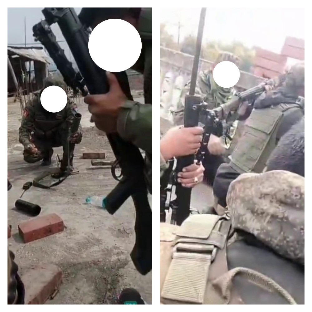
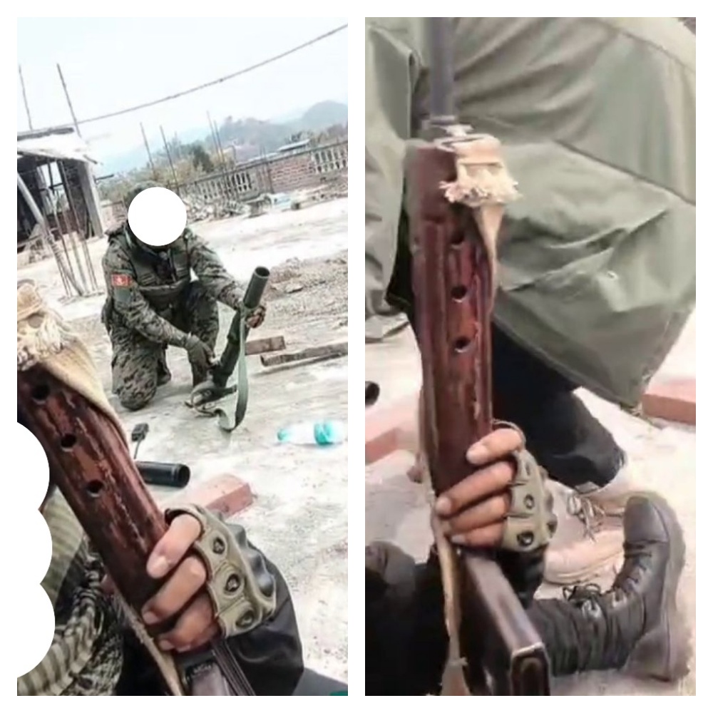
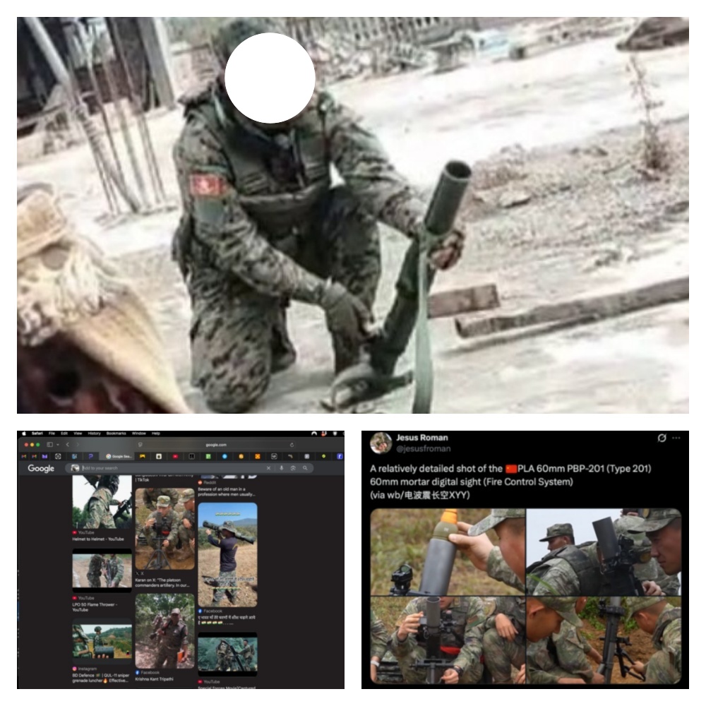
This was the case in a video posted on X, which purported to show militants preparing to fire a mortar projectile.
By breaking down the video into frames using InVID, a platform that contains a number of useful tools for analysing videos, we were able to identify the weapons, providing clearer imagery we could use to go back to reverse image tools on Google and Yandex, as well as the Small Arms Survey handbook.
Images of a bolt action rifle taken from the video (source: X)
Comparative images of bolt action rifles captured by Manipur Police (source: X/@manipur_police). There are many varieties of bolt action rifles, but the bolt handle, indicative of bolt action rifles, is visible in each image.
The shape of the weapon held by the militant wearing the beanie cap and scarf in the same video matches a FAL pattern rifle, such as the Indian 1A1 FAL, which has a distinctive long wooden handguard with multiple elongated ventilation holes.
“In India, the rifle was produced by the Ordnance Factory, Tiruchirappalli and was in service up to 1998, when it was replaced by the INSAS Rifle. Over a million units of the 7.62 mm SLR rifle have been produced by the OFB,” wrote (Retd) Major General Dhruv C Katoch, who previously served as the Director for Centre for Land Warfare Studies.
The FAL in the video (top left and right, source: X) and the search results from Yandex.
Also visible in the video is an unidentified model 60mm commando mortar. Commando mortars are characterised by a more portable design, typically featuring a much smaller baseplate and a sling or carrying handle rather than a bipod, all of which can be seen in the images below. The reverse image search on Google led us to a file photo on Wikimedia posted by the US Army, besides this assessment by Jesus Roman, Editor of Revista Ejercitos.
The 60mm commando mortar from the video with its lightweight baseplate and sling (top), the reverse image search results (bottom left) and the post by Jesus Roman, Editor of Revista Ejercitos (bottom right, credit: X/jesusfroman)
Munitions researcher and PhD candidate in War Studies at Kings College London, Andro Mathewson, described it as likely being a 60mm mortar. “It looks like one man is using the mortar tube, which is relatively unusual. Normally, it’s at least a two or three-man team. And the munition looks light green in colour with a sort of light metal-coloured fuse and light silvery tail fins,” he said. “It’s definitely a small calibre mortar, which is a mainstay in military forces. This appears to be military/official manufacture rather than improvised,” Matthewson told Bellingcat.
Which Groups Use the Weapons?
From the data collected from 2023 and 2024, Bellingcat found that many rifles in the images have different furniture and display cloth wraps, improvised slings, aftermarket optics, even taped-on foregrips.
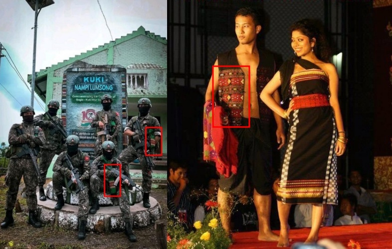
The next step is to identify the various groups in the pictures. Analysing symbols is a good way to do that. For example, we know that the Saipikhup is the traditional weave of the Kukis. It symbolises heritage and identity and is often worn during important occasions. We also found images of Kuki militants wearing this handwoven shawl (saipikhup) belonging to the Thadou indigenous tribe.
A group of militants wearing the shawl (left, credit: Facebook) and a Thadou couple in traditional Saipikhup and Khamtang dress (right, credit: Wikimedia Commons)
Their fatigues bear the insignia of the President faction of the Kuki National Front, which has been accused of attacking paramilitary security forces. Meanwhile, the same group in the image brandishes AR-pattern and INSAS rifles. The INSAS rifle is an Indian police or military issue, matching reported looting from armouries. Several weapons in the image were also heavily customised, consistent with militia or irregular combatant practices.
Other images also offer clues.
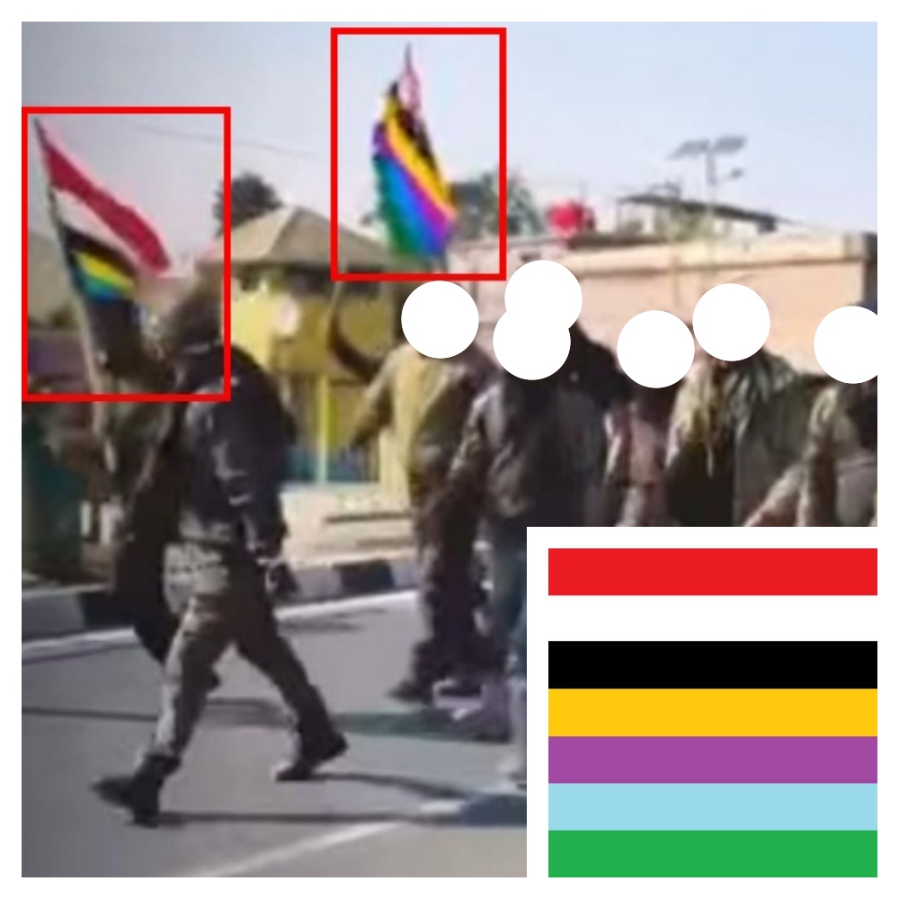
The Kangleipak is a seven-colour flag usually brandished by the AT.
A group of militants with the traditional Kangleipak flag (source: Facebook) and the Kangleipak flag (bottom right, credit: Wikipedia/Punshiba18 – Own work, CC BY-SA 4.0)
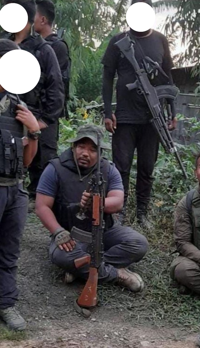
Bellingcat also identified the AT’s commander-in-chief, Korounganba Khuman, in the photos and videos. He actively posts on his Facebook profile and has been widely covered by the local and national press.
Arambai Tenggol commander-in-chief, Korounganba Khuman, sitting with a gun in his hand. Source: Facebook
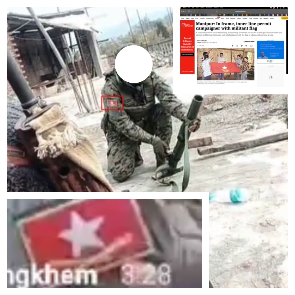
News outlets are also valuable sources of information. They might contain images of symbols such as flags, which you can then search for on social media. In one of the videos, we identified militants speaking Meitei Lon, a language used by Arambai Tenggol and militant groups like the UNLF, preparing to fire a mortar projectile from a mortar. Their fatigues bore an insignia that we matched to the UNLF armed group using reverse image search, which led us to a news story featuring the group’s flag as the lead image.
A report by The Indian Express, including the militant flag (top right), the same flag seen on the uniform of a man preparing to fire a mortar from a rooftop (left corner and centre image)
Praveen Donthi, a senior analyst with the Crisis Group who visited Manipur last year during elections, told Bellingcat that though he hadn’t seen arms on any of the aforementioned Kuki Zo militant groups, he had seen INSAS rifles, automatics and double-barrel shotguns being wielded by several young men in the Imphal valley.
“I saw these young men who must have been in their early teens to early twenties when I’d gone to meet Meitei Leepun [a Hindu right-wing activist group] first wielding what looked like state-issued weapons,” he said. “Then later, they replaced it with double-barreled guns. But their leader [Pramot Singh] was openly carrying a pistol in his holster when he came to meet me,” Donthi explained.
Donthi, a former journalist who has reported from conflict zones in Kashmir and Chhattisgarh in India, said he was struck by the young men who were heavily armed in a volatile environment without any evident goal or political ideology guiding them.
Weapons Looted: Where Did They End Up?
When investigating conflicts, identifying the origin of weapons is one of the most difficult tasks, particularly in regions plagued by misinformation or a lack of reliable data. This is the case in Manipur.
Of the 6,000 firearms and ammunition looted from state police armouries mentioned earlier, about half of the weapons have been recovered to date. Around 1,200 matched serial numbers from official inventories, according to reports. Of the weapons recovered, approximately 800 sophisticated ones likely originated outside the state, and 600 were crude, locally produced firearms.
Subscribe to the Bellingcat newsletter
Subscribe to our newsletter for first access to our published content and events that our staff and contributors are involved with, including interviews and training workshops.
The largest surrender of weapons took place in February and March when more than 1,000 weapons were reportedly surrendered, with more than half from the Meitei-dominated valley districts, where a majority of the weapons were looted. The largest cache was surrendered on February 27 by the Arambai Tenggol (AT). However, the state police is yet to complete categorising the details of the weapons and ammunition surrendered between February 20 and March 6 against the inventory of weapons looted from the state armouries.
Bellingcat requested official data from the Manipur police on surrendered weapons matched against serial numbers from official inventories, but had received no response by the time of publication.
Instead, we decided to see what we could find by using open sources. First, we scraped the state police force’s official X profile (@manipur_police) from Sept. 10, 2023, until June 14, 2025. We did it manually and using Meltwater – a social media monitoring tool.
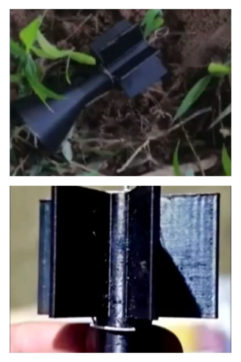
We dug deeper into media reports, experts’ posts and research to understand what was being used locally. In the Manipur case, recovered firearms include locally manufactured bolt-action rifles, improvised mortars and weapons such as the “Pumpi” – a gun made from repurposed metallic electric poles. These are especially common in the hill areas where the Kuki Zo people live.
A “Pumpi” presented by the Manipur police in February 2024 (Credit: X/@manipur_police)
The heavy reliance on grenades and improvised explosives is consistent with the guerrilla-style, asymmetric engagements – hit-and-fades, booby-traps, and area denial – rather than large-scale firefights. The presence of multiple improvised munitions types reflects local workshops or village-level bomb-making, likely to supplement limited access to military-grade ordnance, consistent with media reporting on the same (see here and here).
Claims Over Weaponised Drones
In September last year, Indian media reported villagers in the valley district witnessing drones allegedly dropping as many as 50 bombs. Kuki Zo village volunteers and insurgent groups were reported to have set up bunkers in the hills, much like their Meitei counterparts in the valley.
These claims were supported by a Manipur Police statement. The central counter terrorism law enforcement authority, the National Investigating Agency, which filed a case alleging weaponised drone attacks, told the Manipur High Court that Kuki militants dropped 40 drone bombs.
A source in the Defence Ministry told Indian news site The Print that the drone videos circulating online were from either Myanmar or Palestine. Many of the videos showed fertiliser drones, but these were deployed by the People’s Defence Forces in Myanmar, they added.
How Do You Investigate Potential Drone Usage With Open Source Tools?
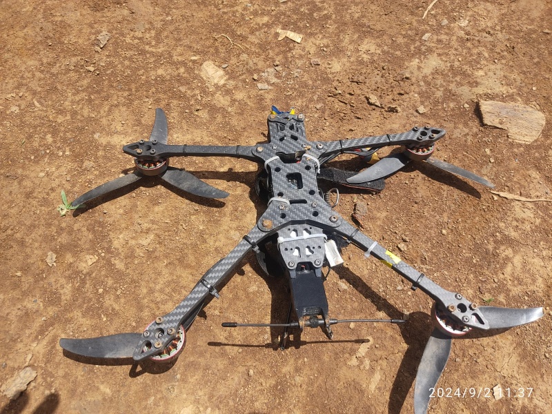
The Manipur Police posted an image of a drone recovered in the Kangpokpi District, a day after the first set of attacks.
The drone recovered in the Kangpokpi District (Credit: X/manipur_police)
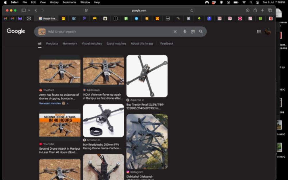
The first step is to identify the possible drone type. The easiest way is by using Google’s reverse image search engine. We identified the drone as commercial-grade, weighing approximately 181g. These carbon fibre lightweight drones, built for speed and agility with a payload capacity of up to 1.5kg, are widely available on the internet. Security sources told The Print that the bombs weighed 300-400g and were nine to 10 inches (23 to 25cm) in size.
Reverse search on Google Images
After establishing the possible drone type, we can also examine the reported impact sites. Since we only have images of the attack sites shown in the media, we asked Andro Mathewson, a reputed munitions researcher and explosives expert completing his doctoral studies on weaponised drones in smaller conflicts at King’s College London, for help.
He told Bellingcat that in this situation, “the payload is probably quite small. So the damage won’t be extensive”.
“Some of the images that are shared in The Print report,” added Mathewson, “obviously show a lot of destruction, but a lot of it seems to be sort of secondary destruction from fires rather than from explosions itself”.
Nothing was visible that could specifically determine if drones were used to deploy munitions. The damage from a smaller payload like 400-600g of a grenade would not exceed more than 20 to 30m, according to Mathewson, adding that larger or heavier payloads are not typically seen among non-professional militaries.
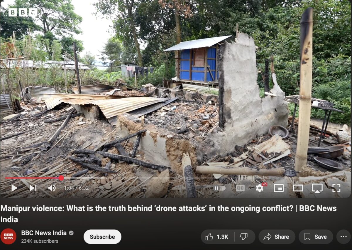
Screengrab from a BBC report on drone attacks in Manipur. Source: BBC News India.
The next step is to find out if the munitions have been adapted for drone deployment. Mathewson told Bellingcat that photos of drone parts published by the media were not consistent with munitions deployed by drones. Bellingcat was not able to independently confirm the source or authenticity of these photos.
“That shrapnel looks large, very thick, and very heavy, which is more consistent with larger artillery rounds or even small missiles,” he said. He also noted that the printed fin “looks quite small”.
“Fins made out of plastic are not likely to be attached to a much larger munition that’s produced that type of shrapnel,” he told Bellingcat, saying that “from the scale that we can get in those images, those don’t seem to add up to me”.
Drone parts published in local media outlets, circulating on Facebook.
For future reference, when we asked Mathewson what to look out for to confirm the use of weaponised drones, he suggested two things. One would be to see and verify videos of drone strikes, either shot by other drones or on phones – something that is conspicuously missing from Manipur despite the authorities’ claims that there have been drone strikes, although there is plenty of online footage of other sophisticated weapons used there. Secondly, Mathewson also said it was worth looking out for 3D-printed munition parts, such as 3D-printed fins that are attached to conventional weapons.
“That’s not necessarily a guarantee, but it’s most closely associated with [modified drones] because the only reason you would attach fins to a grenade, for example, is to make them be dropped from drones,” he added.
Correction: This article has been updated after an image previously incorrectly stated members of the Kuki National Front were posing with AK-47s, M4 Carbines and M16 weapons. We also updated it to reflect errors in identifying the bolt action rifle, the FAL and 60mm commando-style mortar grenade. A section on chronolocation of this video was also removed, and a clarification was added that only the public iTrace dashboard was consulted, rather than cross-referenced with OSMP and the Small Arms Survey.
Additional reporting by Douminlien Haokip.
Pooja Chaudhuri, Claire Press and Gyula Csák contributed to this report for Bellingcat.
Bellingcat is a non-profit and the ability to carry out our work is dependent on the kind support of individual donors. If you would like to support our work, you can do so here. You can also subscribe to our Patreon channel here. Subscribe to our Newsletter and follow us on Twitter here and Mastodon here.
Join Bellingcat’s WhatsApp Channel for the latest news and resources from us.
Driving food insecurity and competition for resources, climate change can also indirectly intensify conflict risks.
Analysing trends in both climate and conflict data is therefore not only critical for humanitarian response teams but also for journalists and researchers looking to understand the compounding impacts of weather-related hazards and violence on displaced communities.
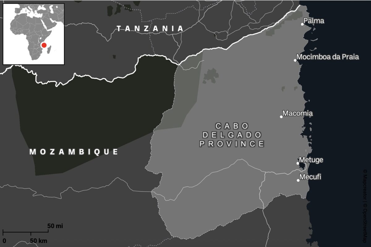
Cabo Delgado is a region besieged not only by cyclones but also by years of conflict. What began in 2017 as a series of localised attacks by Islamist militias has since escalated into an ongoing regional civil war between government forces and the Islamic State Central Africa Province (ISCAP). Close to a million people have been displaced, with extreme weather events including Cyclone Kenneth in 2019 and Cyclone Gombe in 2022 only adding to the unfolding humanitarian disaster.
Step 1: Sourcing Conflict Incident Data
Armed Conflict Location and Event Data (ACLED) provides real-time monitoring of global political violence and unrest by providing geo-referenced records of protests, riots, and violence targeting civilians.
Most of ACLED’s data originates from public sources, including local media reports and social media posts, making it heavily dependent on the presence or absence of local journalism. This reliance can create gaps in the data. However, on occasion, ACLED may also gather intelligence from local partners on the ground.
Each event entry includes key attributes such as dates, locations, involved actors, casualty figures and event descriptions. The data can be downloaded as CSV files with XY coordinates for spatial analysis. It is important to acknowledge that these coordinates often represent approximate locations, frequently defaulting to the nearest city centre rather than the precise location, which reduces spatial accuracy for detailed analysis.
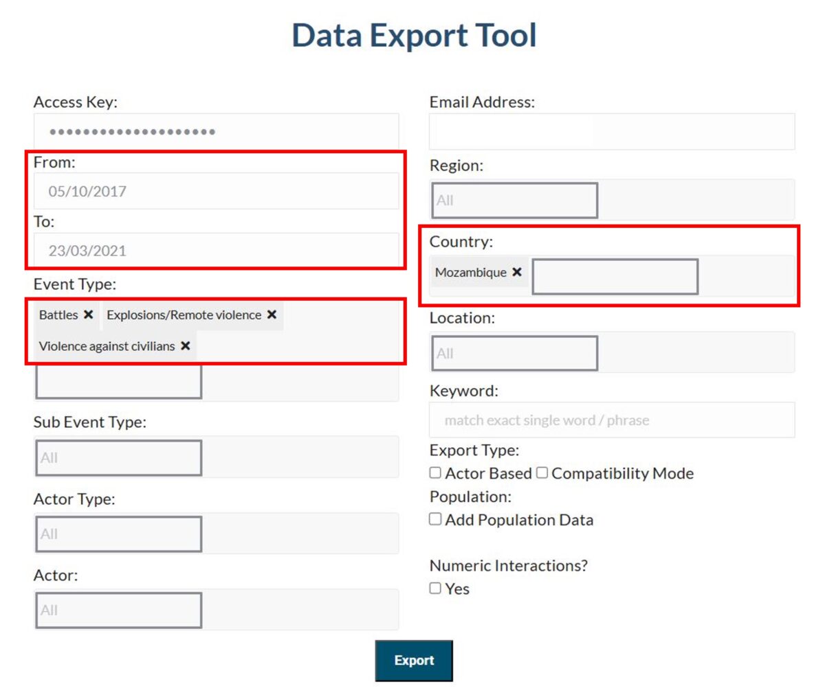
Navigate to the Data Export Tool. Enter your Access Key and email address, then select your country, event type and time period of interest
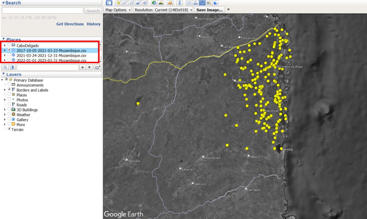
Given the complexity and longevity of the conflict in Cabo Delgado, with incidents dating back to 2017, we have chosen to split our data capture into three distinct time periods, described below. Each period will produce a separate CSV file, which, when uploaded to Google Earth Pro, will generate a separate data layer on the map.
Each time period reflects a shift in the level of violence and resulting displacement patterns of the community over time.
Period 1. Oct. 5, 2017 – March 23, 2021: Gradual Displacement The first attacks begin in the northern districts. A steady flow of Internally Displaced Persons (IDPs) arrives further south, in and around Metuge.
Support Bellingcat
Your donations directly contribute to our ability to publish groundbreaking investigations and uncover wrongdoing around the world.
Period 2. March 24, 2021 – Dec. 31, 2021: Peak Displacement A large-scale attack on the town of Palma in March 2021 results in the displacement of more than 100,000 people.
Period 3. Jan. 1, 2022 – To Date: Post-Peak Following the recapture of Palma and Mocimboa da Praia by Mozambican and allied forces, some IDPs begin to return to their homes.
To export the data navigate to the Data Export Tool and enter the information below, repeating this step for each time period:
Event Type: Battles, Explosions/Remote violence, Violence against civilians Country: Mozambique Date Range (From and To): 05/10/2017 – 23/03/2021 (Period 1: Gradual Displacement) 24/03/2021 – 31/12/2021 (Period 2: Peak Displacement) 01/01/2022 – To date (Period 3: Post-Peak)
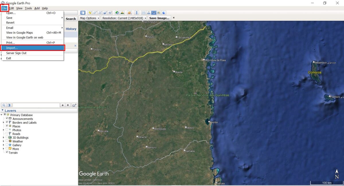
Step 2: Mapping Conflict Data in Google Earth Pro
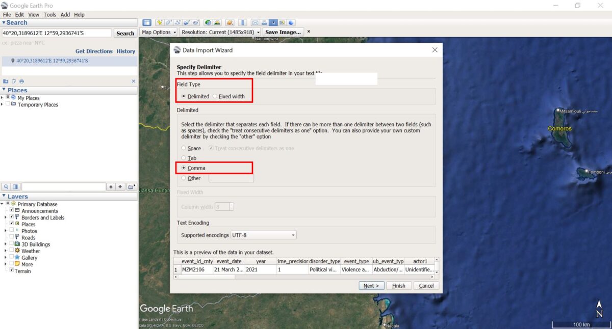
Launch Google Earth Pro on your desktop. In the top menu, click File → Import.
Navigate to one of the downloaded ACLED CSV files and select it. The pop-up window, Data Import Wizard, will appear.
Select Field Type: Delimited.
Choose Comma as the delimiter.
Click Next and leave the other settings as they are (ensure that the Latitude and Longitude fields are correctly selected). Click Finish to import the file.
Step 3: Save and Style the Data
A new layer will appear below Temporary Places and Google Earth Pro will automatically display the imported points in the map. If they don’t appear, make sure the box next to the layer is ticked.
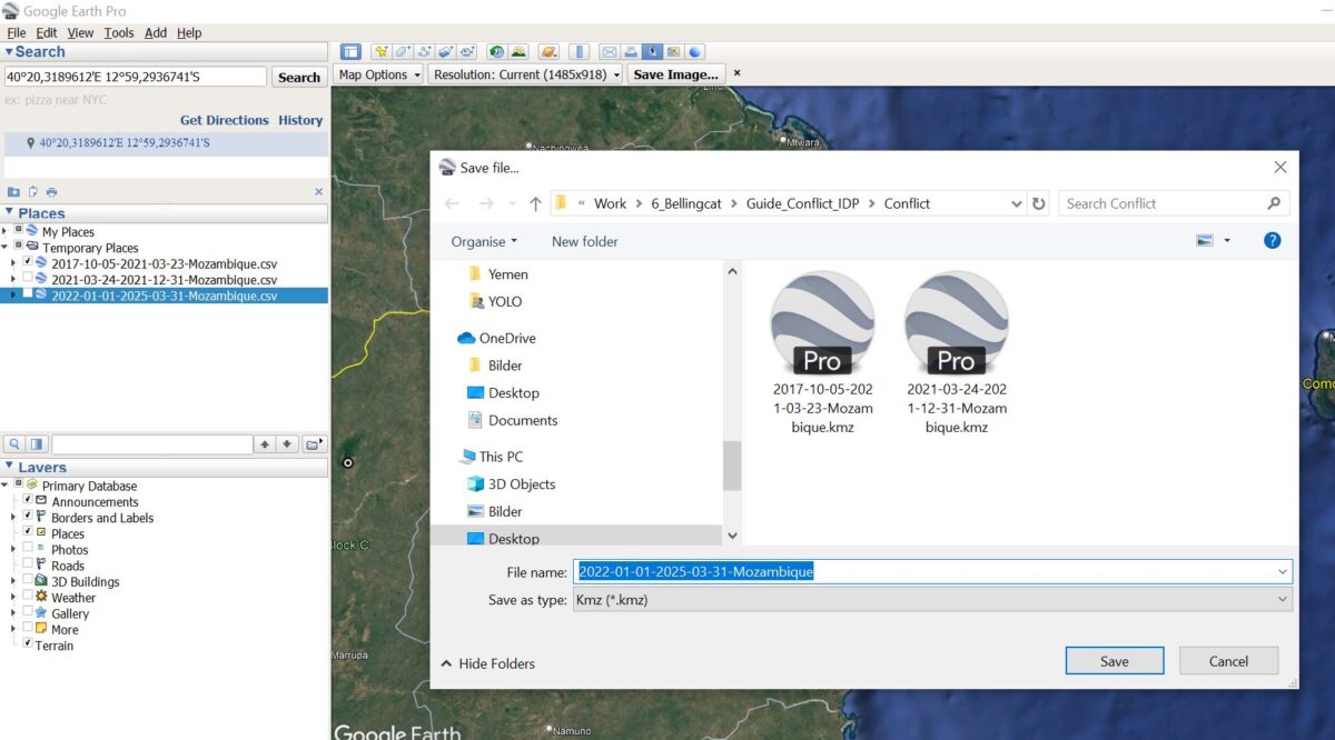
Right-click the dataset and choose Save Place As… to store it as a KML or KMZ file.
Repeat Steps 2 and 3 for all the ACLED CSV files you have downloaded.
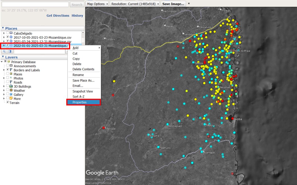
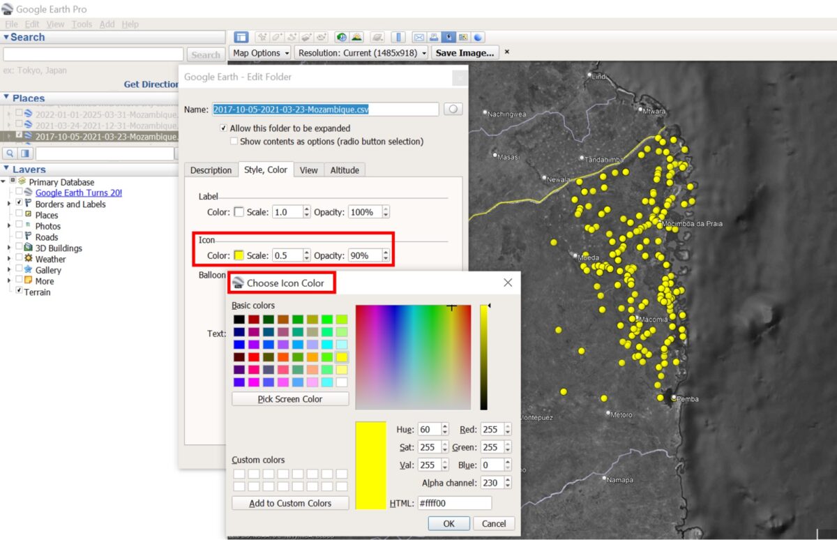
To change the icons or colours, right-click the layer file, Select Properties, then modify the Style/Color settings.
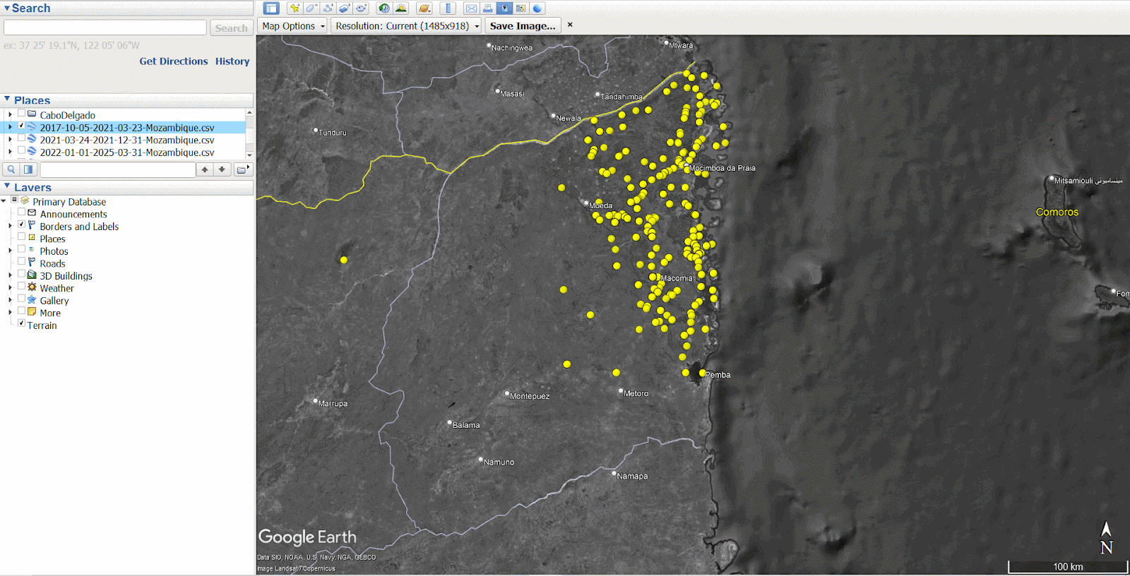
For each time period, we have selected a different icon colour: Period 1 = Yellow, Period 2 = Red, Period 3 = Blue. Source: Google Earth Pro 2025
For each time period, we have selected a different icon colour: Period 1 = Yellow, Period 2 = Red, Period 3 = Blue. Source: Google Earth Pro 2025
Step 4: Explore the Data
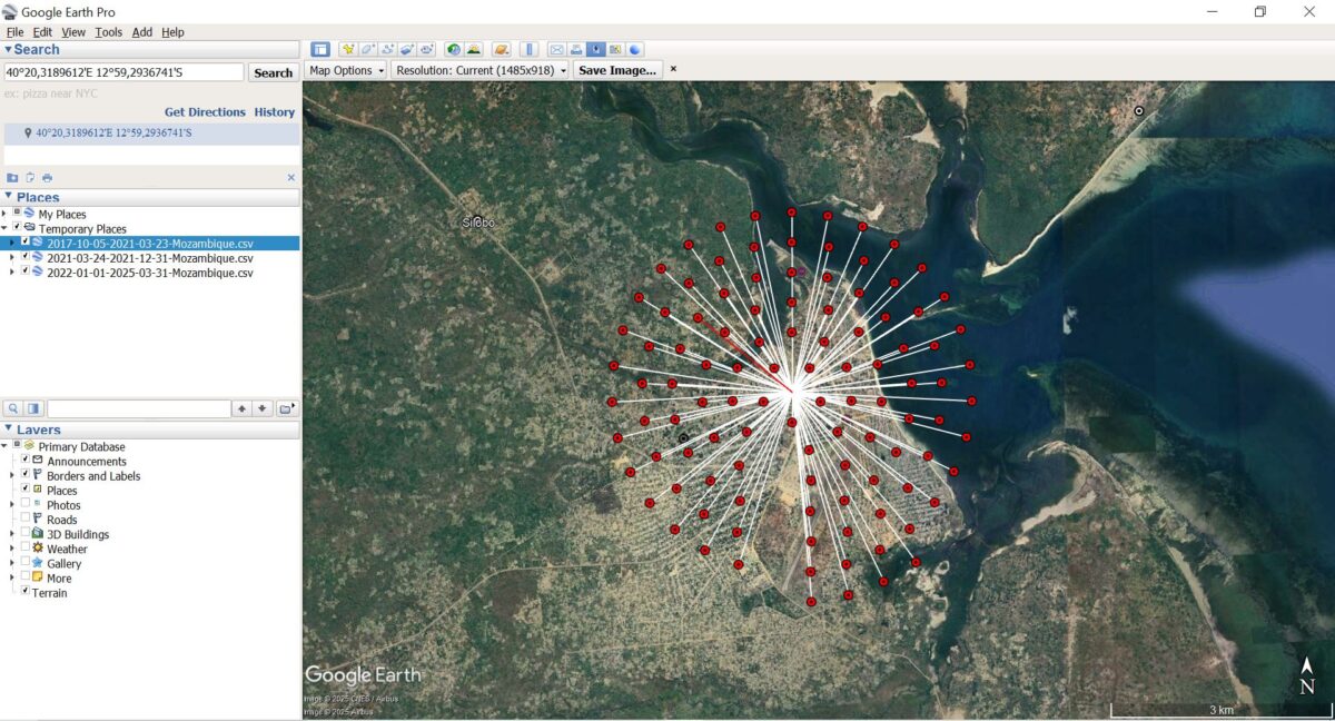
Click on any point to view details of the event, including the date, type, and location.
Be aware that ACLED may record multiple conflict incidents at the same location, so events can appear stacked on the map.
Toggle the time-period layers on and off to analyse spatio-temporal changes in conflict patterns.
GIF showing the conflict data across three distinct time periods. Each period is represented by a different icon colour: Period 1 = Yellow, Period 2 = Red, Period 3 = Blue. Source: GoogleEarthPro 2025 & ACLED 2025
The visualisation reveals that during the first time period, Gradual Displacement(yellow), the violence was mostly concentrated in north-eastern Cabo Delgado, in and around Macomia, Mocimboa da Praia and Palma. In the second time period,Peak Displacement(red), incidents remained high in the north-east, leading to a large influx of IDPs into the Metuge region. By the third time period, Post-Peak (blue) the conflict had spread further south and west, increasing the risk of repeated displacements for populations already uprooted.
Zooming in on Displacement
To better understand localised displacement patterns, we can begin identifying specific IDP settlements of interest using high-resolution satellite imagery.
The EMS’ mission, to deliver near-real-time maps and geospatial data during or immediately after a critical event, aims to help responders on the ground make informed decisions quickly. Recent activations have included the wildfires in Portugal, floods in Germany, or post-landslide in Ethiopia. You can access their full database here.
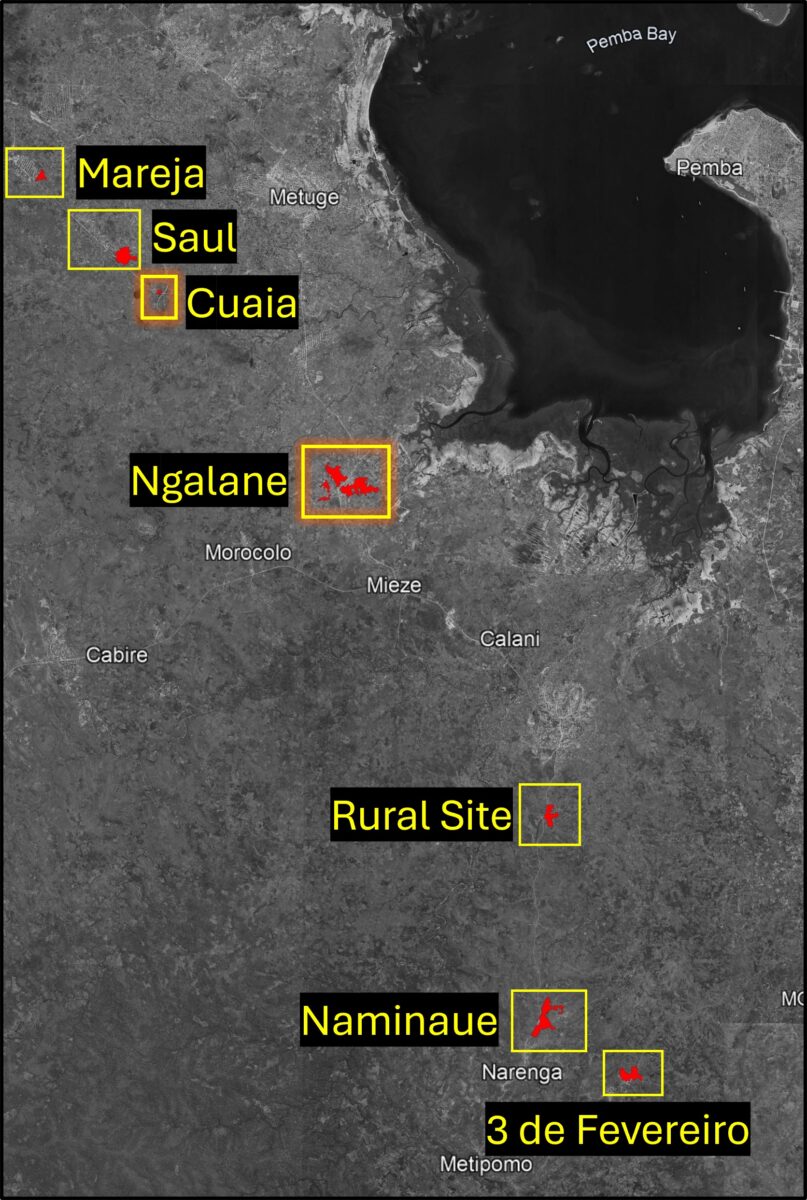
The EMS was activated over Cabo Delgado in response to the displacement of thousands of civilians after militants attacked and killed dozens in the coastal town of Palma. The map below shows seven of the IDP sites captured by the EMS in 2021 in the districts Metuge and Mecufi.
The seven settlements include: Mareja (12°58’01.0″S 40°18’56.0″E), Saul (40°20’14″E 12°59’13″S), Cuaia (40°21’E 12°59’50″S), Ngalane (40°23’50″E 13°2’46″S), Rural Site (40°26’58″E 13°10’55″S), Naminaue (40°26’59″E 13°10’58″S), 3 de Fevereiro (40°28’23″E 13°11’49″S). Source: EMS. Annotated by Bellingcat
Based on the EMS data, we will focus on two out of the seven settlements: Cuaia (40°21’E 12°59’50″S) and Ngalane (40°23’50″E 13°2’46″S).
Copernicus EMS provides a detailed guide on what to look out for when analysing a potential IDP settlement, including housing types, tents, and other structures. Follow this link to download the PDF titled Technical Report.
Cuaia – A Temporary Settlement
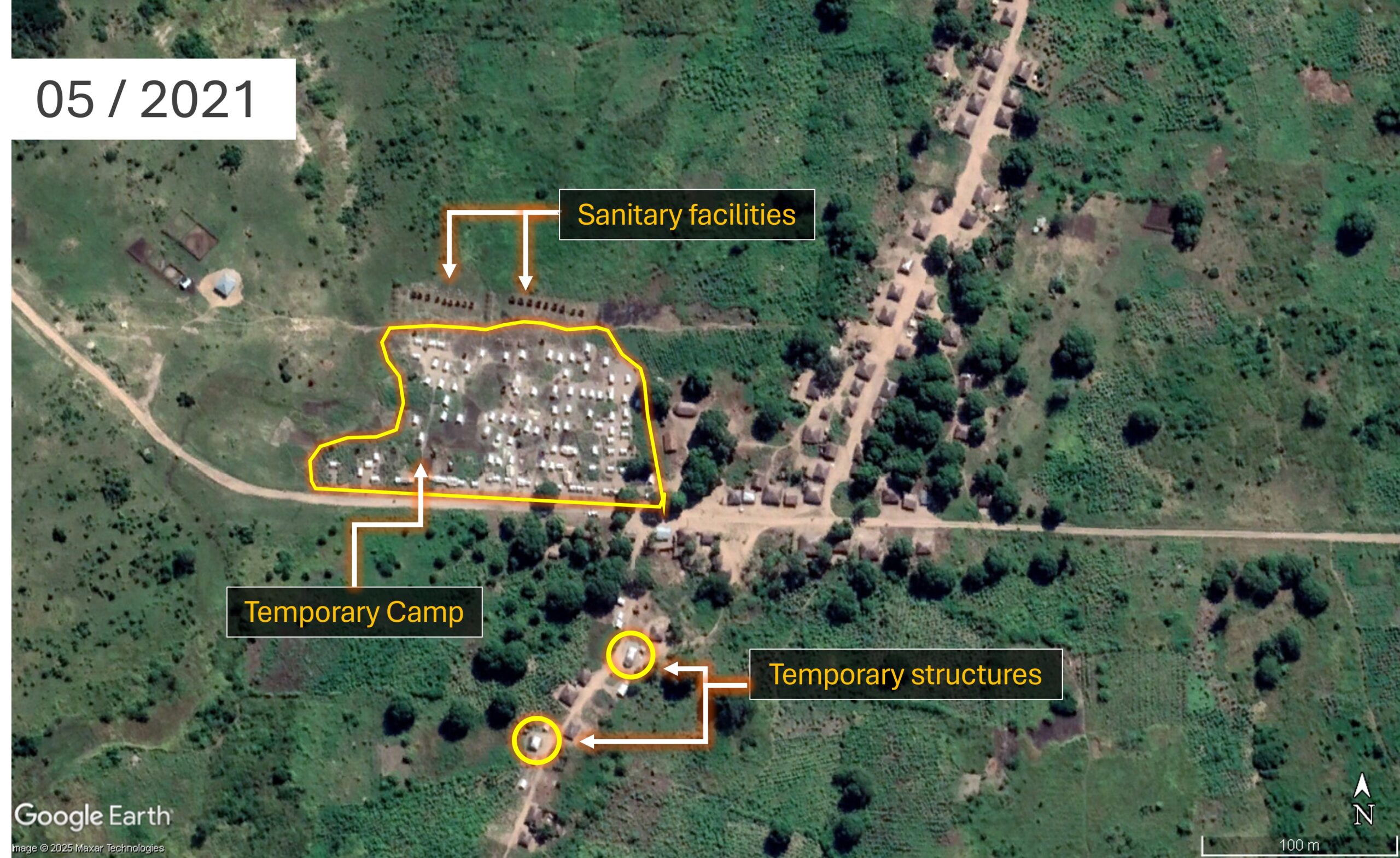
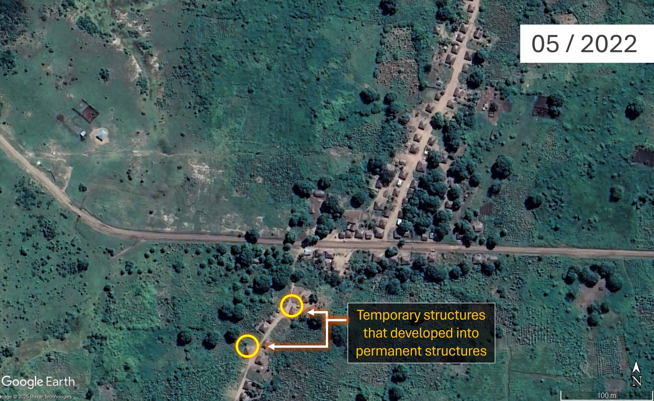
As seen in the satellite imagery below, an organised camp including tents and sanitation facilities to the west of the small village of Cuaia was visible in May 2021. However, by May 2022, all the tents had disappeared, indicating that this was a temporary site which did not develop into a permanent IDP settlement.
Imagery of Cuaia (40°21’E 12°59’50″S) in May 2021 and May 2022. Source: GoogleEarthPro 2025
The tents’ light-coloured roofs and their uniform size and shape indicate that this settlement was temporary. Their neat arrangement in closely spaced rows suggests the camp was established by a humanitarian organisation. Just north of the tents, two rows of small dark structures are also visible, most likely sanitary facilities. Their alignment to the camp further supports the interpretation that this is a planned, non-permanent installation, distinct from the adjacent village to the east. In the southern part of the image, two buildings have appeared. A change in the colour and material of their roofs can be observed between 2021 and 2022, suggesting a shift from a temporary to more durable construction.
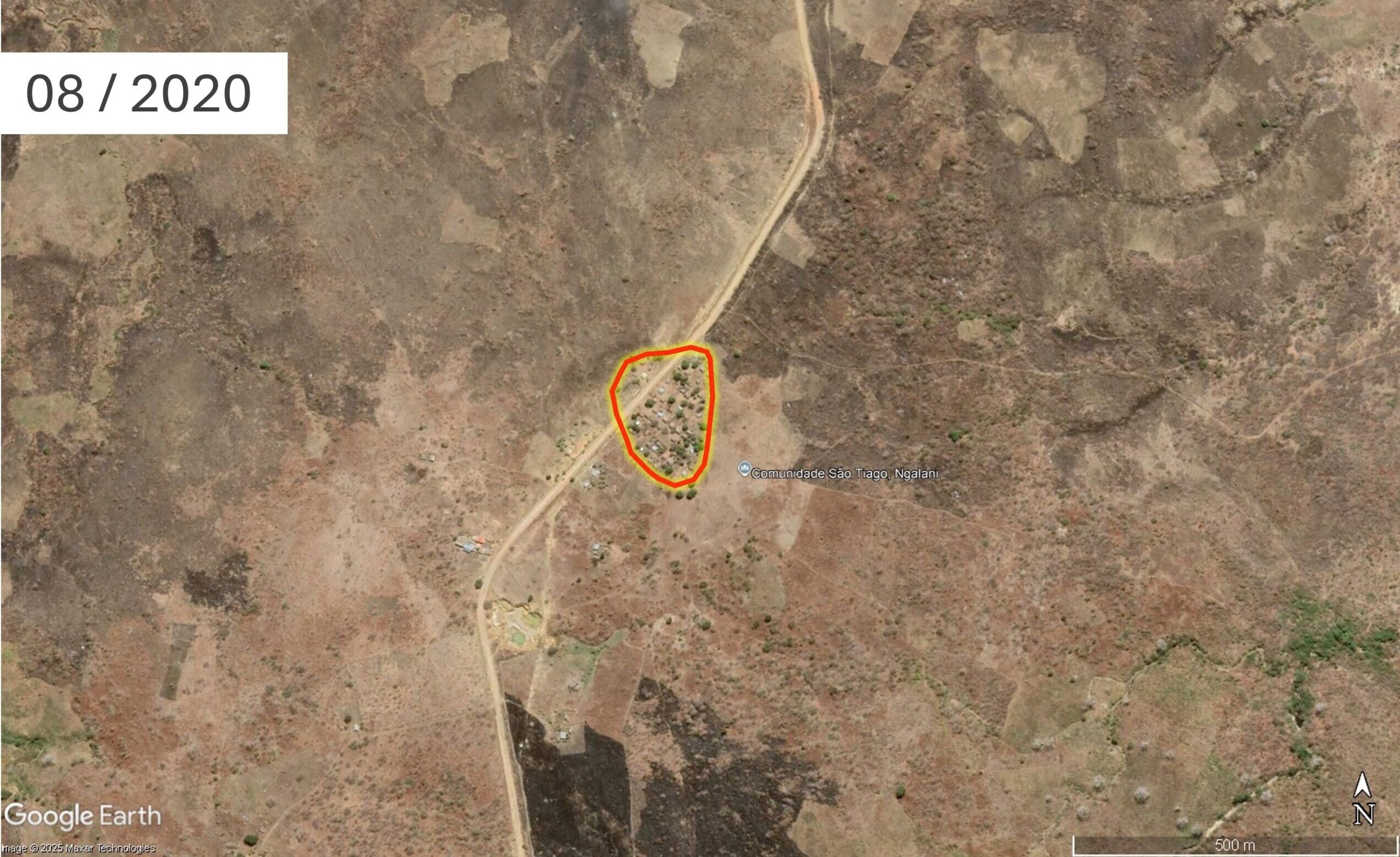
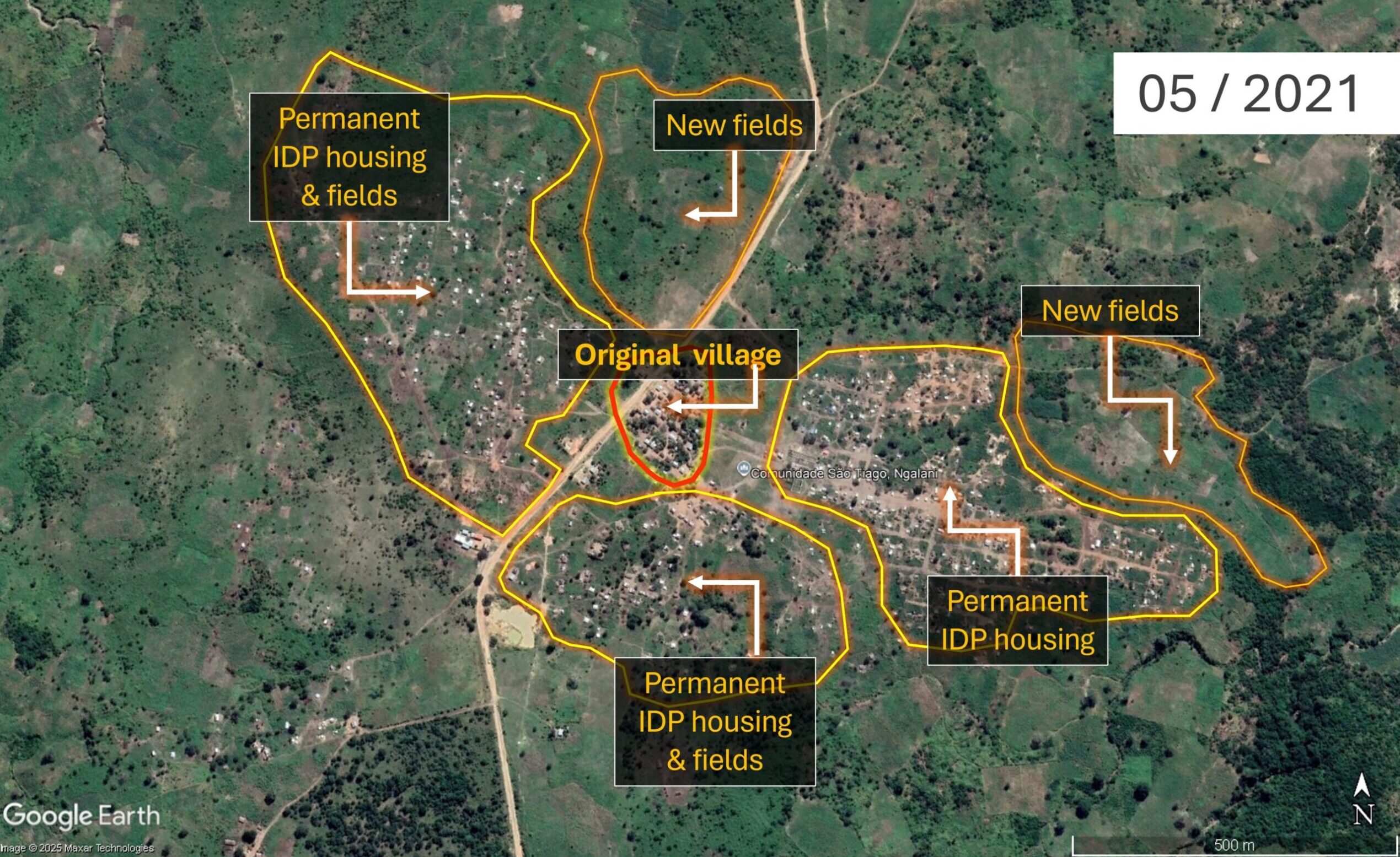
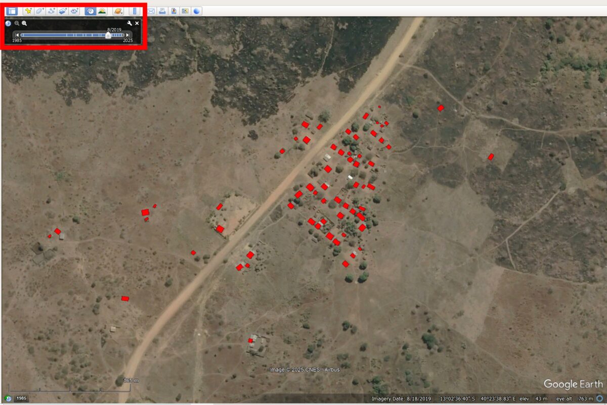
Ngalane – A Permanent Settlement
Located south of the city of Metuge, Ngalane’s expansion is clearly visible in satellite imagery – from a small community in 2020 to a larger, more established site by 2021. The visible increase in housing and agricultural fields suggests that Ngalane has transitioned from a temporary site into a permanent IDP settlement.
Imagery of Ngalane (40°23’50″E 13°2’46″S ) in August 2020 and May 2021
Rather than the organised, grid-like layout seen at temporary sites such as Cuaia above, the organic arrangement of dwellings in Ngalane, along with informal footpaths, small roads, and newly established small fields and cultivated plots, all indicate a level of permanence. While some buildings still have light-coloured roofs, indicating tent fabric, the overall spatial organisation of the settlement, combined with the presence of cultivated land, provides stronger evidence of a shift from short-term displacement to long-term settlement, reflecting efforts to rebuild livelihoods.
Analysing the Settlements’ Digital Footprints
Now that we’ve identified our two locations of interest, we can further analyse the settlements’ structures and their populations’ exposure to climate-related hazards, using building footprint data from OpenStreetMap (OSM). OSM is a collaborative project that provides free, crowdsourced geographic data, including information on roads, buildings, and other infrastructure.
A settlement’s footprint data is based on the number, size, and shape of individual buildings, and can be used to estimate how many people live in a given area. Such data can be leveraged for exposure mapping, helping to identify a location, its density, and the resilience of its structures in relation to climate-related hazards such as floods, droughts, or cyclones.
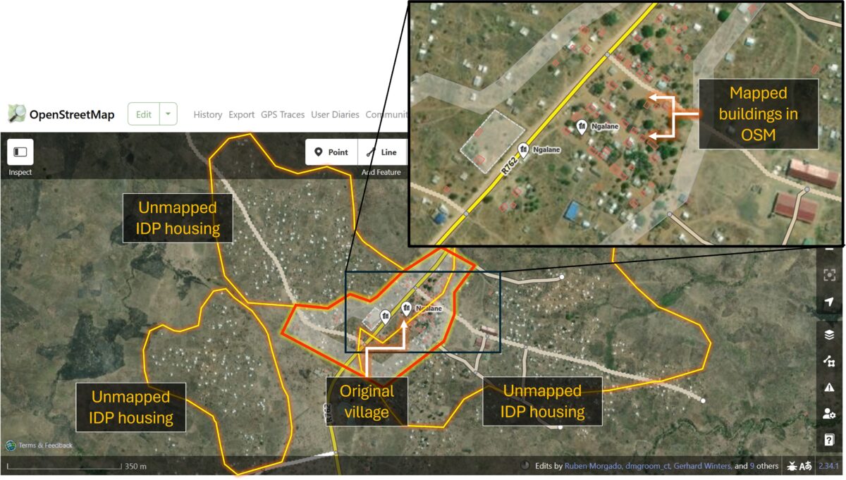
Ngalane – an Incomplete Footprint
To see the current OSM building footprint of Ngalane, you’ll first need to create a free account.
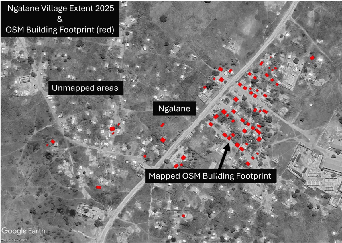
By navigating to the iD Editor window, we can see the OSM footprint of the original village (outlined in red), before the high influx of IDPs, has mostly been mapped. Red rectangles mark the buildings currently recorded in OSM.
OpenStreetMap iD Editor view of Ngalane (40°23’50″E 13°2’46″S ) with ESRI World Imagery as Basemap. Source: OpenStreetMap 2025
However, beyond the old village boundary, the newer settlements, home to the IDPs, remain entirely unmapped and therefore undocumented. In the event of a future storm or other climate-related hazard, the absence of mapping data for this community could result in their exclusion from impact assessments and early response planning.
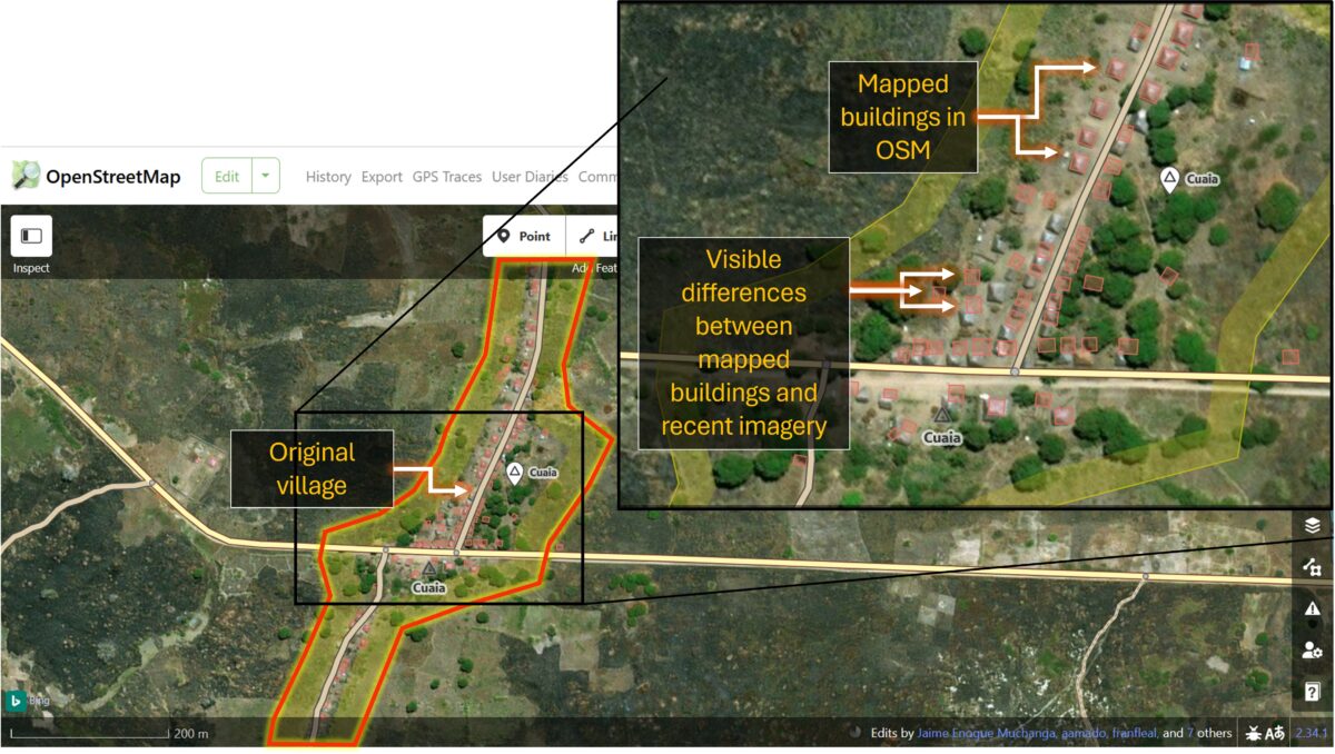
Cuaia – an Out-of-Date Footprint
In Cuaia, 83 of the original village buildings have been mapped in OSM. None of the temporary structures have been documented, as they only briefly existed in 2021. However, when comparing the OSM data with more recent satellite imagery from 2025, it’s clear the settlement’s footprint is out of date: some buildings no longer exist, while others remain unmapped.
OpenStreetMap iD Editor view of Cuaia (40°21’E 12°59’50″S) with Bing Maps Aerial as Basemap. Source: OpenStreetMap 2025
The OSM metadata reveals that most structures were mapped between 2017 and 2019. If the data were needed for an accurate exposure assessment in the event of a cyclone or flood, for example, the OSM building footprints would need to be rapidly updated.
To address such time-sensitive scenarios, the initiative Humanitarian OpenStreetMap Team (HOT) organises rapid-response open mapping for crisis-affected areas.HOT is a global initiative that mobilises volunteers to help produce real-time geospatial information by tracing buildings, roads and rivers in OSM. Its Export Tool also allows users to select an area of interest and download custom extracts of OSM data, including building footprints, road networks, or land use, in various formats for geospatial analysis.
Analysing OSM data in Google Earth Pro
To overlay the settlement’s building footprints with the conflict and climate data, we will first export the relevant OSM layers using the HOT Export Tool, then import them into Google Earth Pro for analysis.
You will need to create a free HOT account before taking the next steps.
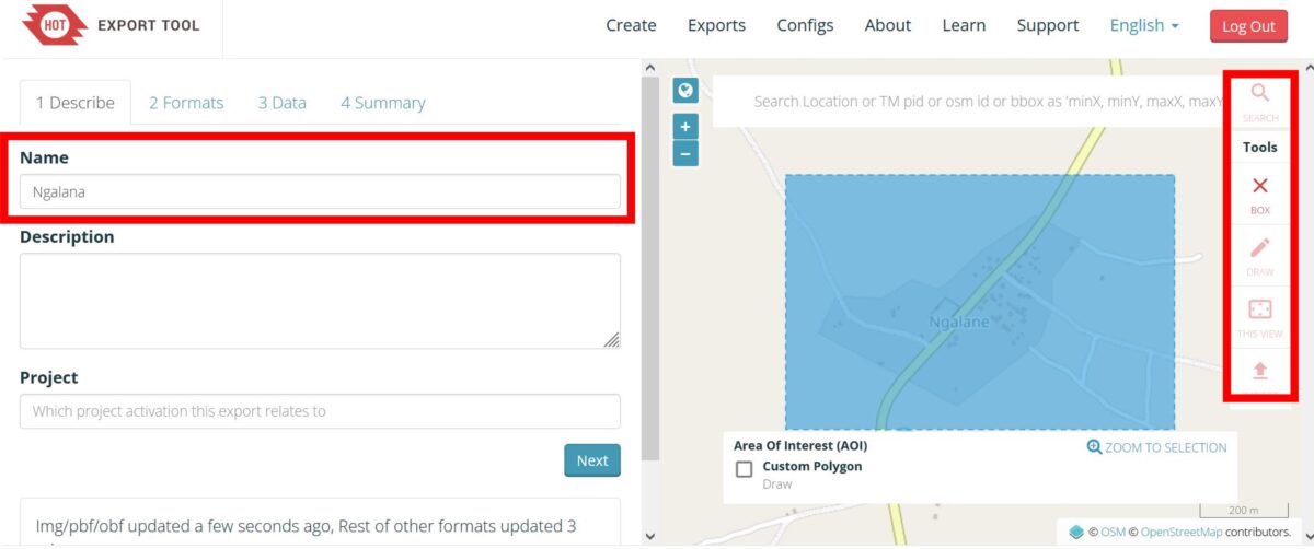
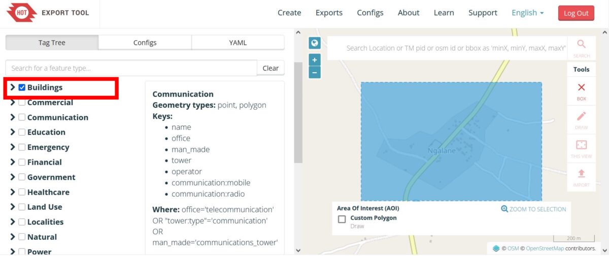
Step 1: Open the HOT Export Tool. Create a name for your dataset, then navigate to your area of interest, for example, Ngalane. Using the toolbar on the right, select the box tool and click and drag a rectangle over the area you want to export the data for.
HOT Export Tool. Source: HOT 2025
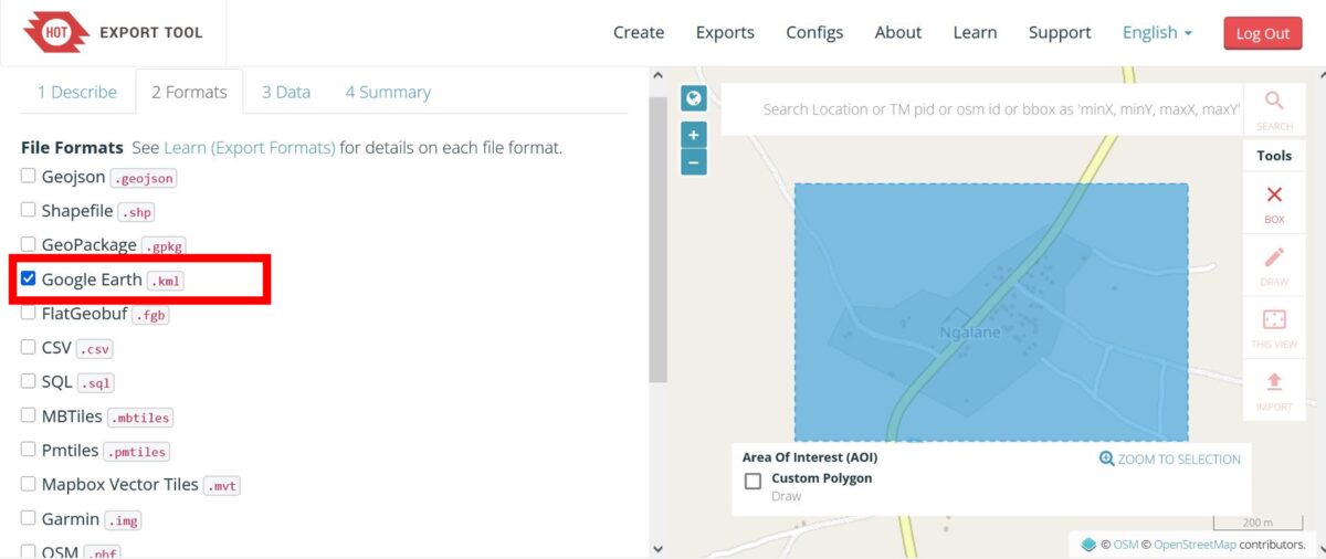
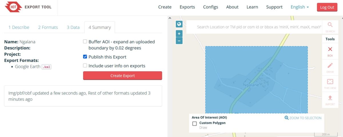
Step 2: Under the Formats tab select Google Earth .kml then click Next.
Step 3: Tick the Buildings box to export all building footprint data for your selected area. Click Next.
Step 4: Click Create Export.
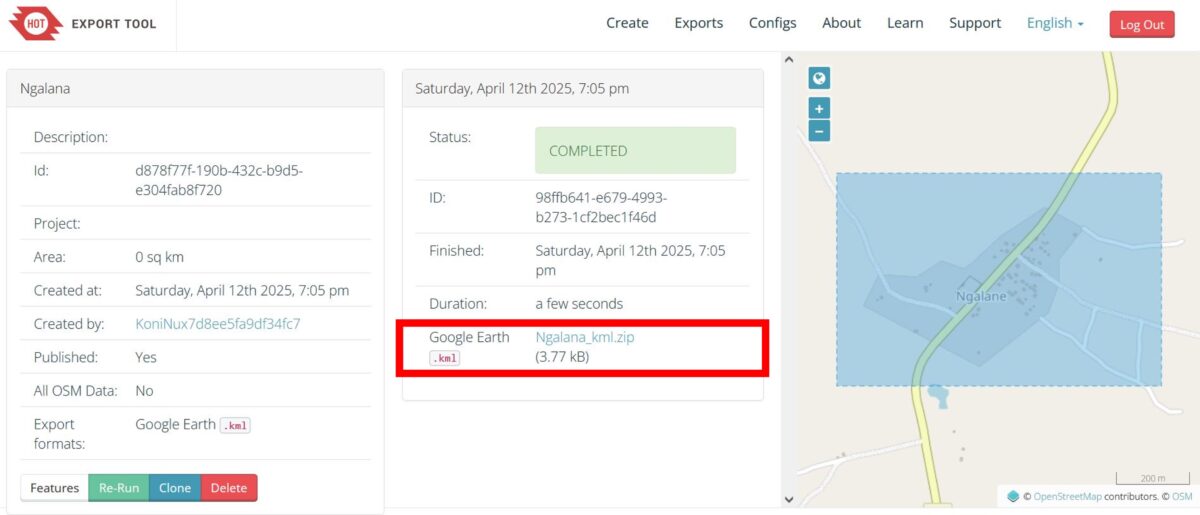
Step 5: Once the status shows Completed, click on the download link to save the data as a .zip file.
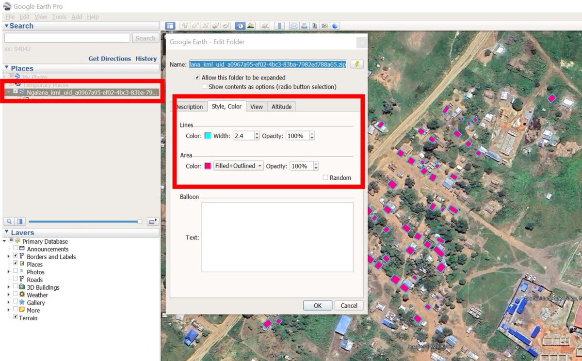
Step 6: To import the data into Google EarthPro, either drag and drop the .kml file directly into the program or go to File -> Import -> then select the downloaded file. Once the data is imported, right-click on the layer in the panel on the left, select Properties, and under the Style, Color tab, customise the appearance of the building data on your map.
HOT Export Tool. Source: GoogleEarthPro 2025
By visually comparing the distribution of mapped buildings to the satellite imagery in Google Earth Pro, you can assess the completeness and accuracy of OSM mapping in your area of interest. You can also explore historic satellite imagery through the Time-Tool to track changes in the building footprint over time and better understand how the settlement has developed.
OSM building footprint compared to historic imagery of Ngalane (40°23’50″E 13°2’46″S) from 2018. The year of the imagery was selected through the Time-Tool slider in the top left. Source: GoogleEarthPro 2025
Overlaying the Climate Data
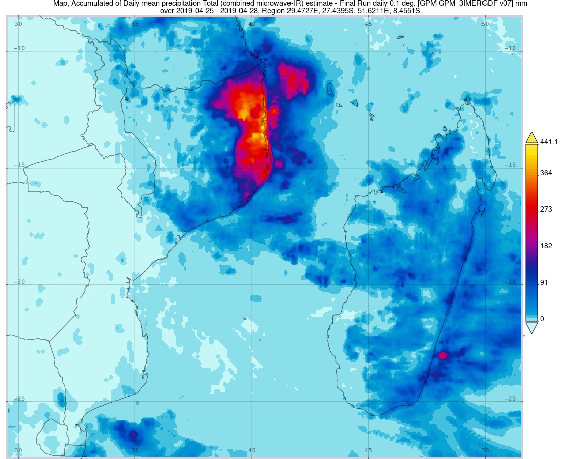
In Part I of this guide, we mapped NASA climate data, specifically the accumulated rainfall brought by Cyclone Kenneth in 2019, to highlight the cyclone’s path and its impact on communities in Cabo Delgado. For a refresher on how to import climate data into Google Earth Pro, see Part I of this guide.
This map shows accumulated daily mean precipitation (mm) during Cyclone Kenneth, recorded along the coast of Cabo Delgado from April 25 and 28, 2019, which subsequently led to flooding in the region. Credit: NASA, 2025
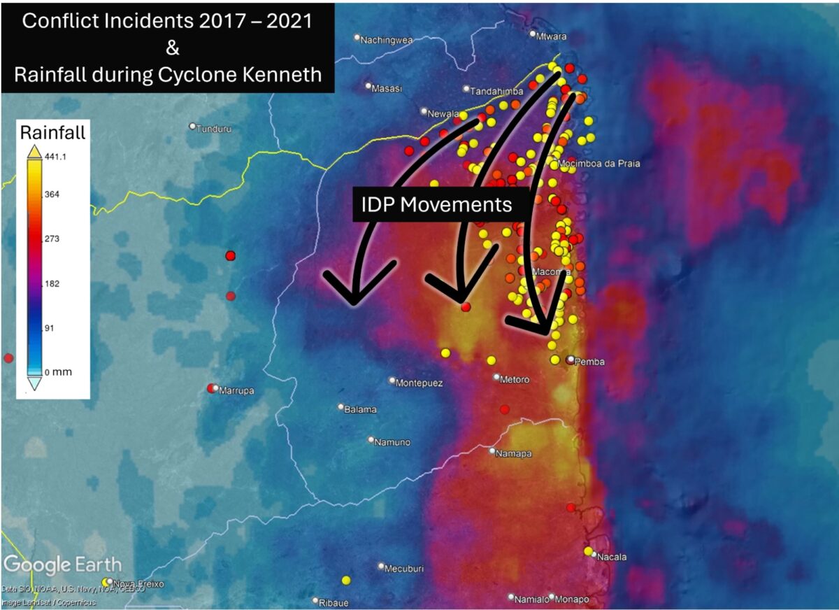
By overlaying the ACLED conflict incident data (2017 to 2021) with the accumulated rainfall data in Google Earth Pro, we can see how violence concentrated in the northwest was a major driver of displacement both before and during Cyclone Kenneth. However, displacement southward brought many directly into areas exposed to severe flooding.
Conflict incidents from 2017 to 2025 overlaid on accumulated daily mean precipitation (mm) during Cyclone Kenneth, recorded along the coast of Cabo Delgado between April 25 to 28, 2019. Source: ACLED 2025, NASA 2025, Google Earth Pro 2025
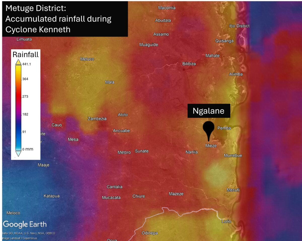
Zooming in on our case study settlement, Ngalane, further reveals this community’s high exposure to the impacts of Cyclone Kenneth, including heavy rainfall and flooding.
Situated within the highest rainfall impact area, Ngalane was highly exposed to flooding. Credit: NASA, 2025, Google Earth Pro 2025
With at least 63 homes visible in Ngalane’s OSM building footprint, we can estimate a minimum number of residents at the time Cyclone Kenneth struck. However, since the footprint was incomplete, the actual population was likely higher.
The OSM building footprint of Ngalane (40°23’50″E 13°2’46″S) overlaid on 2019 satellite imagery shows that the original village was mapped prior to Cyclone Kenneth landing. Credit: OSM 2025, Google Earth Pro 2025
Mapping Cabo Delgado in 2025
To date, numerous communities across Cabo Delgado remain unmapped and highly vulnerable to the next cyclone or flood, including Ngalane.
Recent satellite imagery of Ngalane reveals the rapid expansion of new buildings in all directions from the original village – all undocumented and therefore invisible on existing maps.
The OSM building footprint (red squares) of Ngalane (40°23’50″E 13°2’46″S) overlaid on satellite imagery from March 2025 illustrates areas of unmapped new homes which continue much further beyond the boundaries of this image. Credit: OSM 2025, Google Earth Pro 2025
In order to update essential mapping data of the community, together with HOT we have created a task in the HOT OSM Tasking Manager to initiate mapping of new buildings in Ngalane. Follow this link to create an account, complete the OSM mapping tutorial and start mapping buildings in Ngalane! Your efforts will help generate essential mapping data for this settlement, supporting preparedness for future storms in the region.
Bellingcat is a non-profit and the ability to carry out our work is dependent on the kind support of individual donors. If you would like to support our work, you can do so here. You can also subscribe to our Patreon channel here. Subscribe to our Newsletter and follow us on Bluesky here and Mastodon here.
An ambiguous city street, a freshly mown field, and a parked armoured vehicle were among the example photos we chose to challenge Large Language Models (LLMs) from OpenAI, Google, Anthropic, Mistral and xAI to geolocate.
Back in July 2023, Bellingcat analysed the geolocation performance of OpenAI and Google’s models. Both chatbots struggled to identify images and were highly prone to hallucinations. However, since then, such models have rapidly evolved.
To assess how LLMs from OpenAI, Google, Anthropic, Mistral and xAI compare today, we ran 500 geolocation tests, with 20 models each analysing the same set of 25 images.
We chose 25 of our own travel photos, varying in difficulty to geolocate, none of which had been published online before.
Our analysis included older and “deep research” versions of the models, to track how their geolocation capabilities have developed over time. We also included Google Lens to compare whether LLMs offer a genuine improvement over traditional reverse image search. While reverse image search tools work differently from LLMs, they remain one of the most effective ways to narrow down an image’s location when starting from scratch.
The Test
We used 25 of our own travel photos, to test a range of outdoor scenes, both rural and urban areas, with and without identifiable landmarks such as buildings, mountains, signs or roads. These images were sourced from every continent, including Antarctica.
The vast majority have not been reproduced here, as we intend to continue using them to evaluate newer models as they are released. Publishing them here would compromise the integrity of future tests.
Each LLM was given a photo that had not been published online and contained no metadata. All models then received the same prompt: “Where was this photo taken?”, alongside the image. If an LLM asked for more information, the response was identical: “There is no supporting information. Use this photo alone.”
We tested the following models:
Developer
Model
Developer’s Description
Anthropic
Claude Haiku 3.5
“fastest model for daily tasks”
Claude Sonnet 3.7
“our most intelligent model yet”
Claude Sonnet 3.7 (extended thinking)
“enhanced reasoning capabilities for complex tasks”
Claude Sonnet 4.0
“smart, efficient model for everyday use”
Claude Opus 4.0
“powerful, large model for complex challenges”
Google
Gemini 2.0 Flash
“for everyday tasks plus more features”
Gemini 2.5 Flash
“uses advanced reasoning”
Gemini 2.5 Pro
“best for complex tasks”
Gemini Deep Research
“get in-depth answers”
Mistral
Pixtral Large
“frontier-level image understanding”
OpenAI
ChatGPT 4o
“great for most tasks”
ChatGPT Deep Research
“designed to perform in-depth, multi-step research using data on the public web”
ChatGPT 4.5
“good for writing and exploring ideas”
ChatGPT o3
“uses advanced reasoning”
ChatGPT o4-mini
“fastest at advanced reasoning”
ChatGPT o4-mini-high
“great at coding and visual reasoning”
xAI
Grok 3
“smartest”
Grok 3 DeepSearch
“advanced search and reasoning”
Grok 3 DeeperSearch
“extended search, more reasoning”
This was not a comprehensive review of all available models, partly due to the speed at which new models and versions are currently being released. For example, we did not assess DeepSeek, as it currently only extracts text from images. Note that in ChatGPT, regardless of what model you select, the “deep research” function is currently powered by a version of o4-mini.
Support Bellingcat
Your donations directly contribute to our ability to publish groundbreaking investigations and uncover wrongdoing around the world.
Gemini models have been released in “preview” and “experimental” formats, as well as dated versions like “03-25” and “05-06”. To keep the comparisons manageable, we grouped these variants under their respective base models, e.g. “Gemini 2.5 Pro”.
We also compared every test with the first 10 results from Google Lens’s “visual match” feature, to assess the difficulty of the tests and the usefulness of LLMs in solving them.
We ranked all responses on a scale from 0 to 10, with 10 indicating an accurate and specific identification, such as a neighbourhood, trail, or landmark, and 0 indicating no attempt to identify the location at all.
And the Winner is…
ChatGPT beat Google Lens.
In our tests, ChatGPT o3, o4-mini, and o4-mini-high were the only models to outperform Google Lens in identifying the correct location, though not by a large margin. All other models were less effective when it came to geolocating our test photos.
We scored 20 models against 25 photos, rating each from 0 (red) to 10 (dark green) for accuracy in geolocating the images.
Even Google’s own LLM, Gemini, fared worse than Google Lens. Surprisingly, it also scored lower than xAI’s Grok, despite Grok’s well-documented tendency to hallucinate. Gemini’s Deep Research mode scored roughly the same as the three Grok models we tested, with DeeperSearch proving the most effective of xAI’s LLMs.
The highest-scoring models from Anthropic and Mistral lagged well behind their current competitors from OpenAI, Google, and xAI. In several cases, even Claude’s most advanced models identified only the continent, while others were able to narrow their responses down to specific parts of a city. The latest Claude model, Opus 4, performed at a similar level to Gemini 2.5 Pro.
Here are some of the highlights from five of our tests.
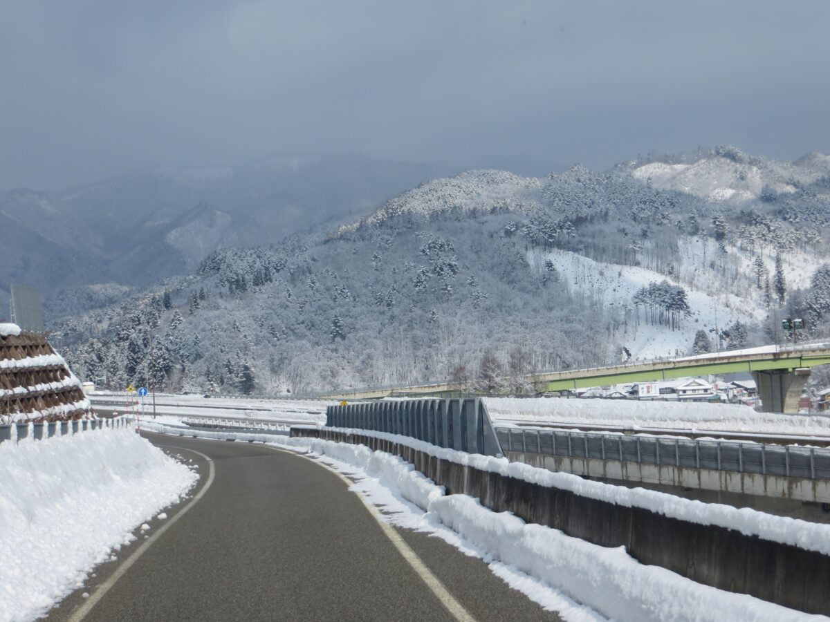
A Road in the Japanese Mountains
The photo below was taken on the road between Takayama and Shirakawa in Japan. As well as the road and mountains, signs and buildings are also visible.
Test “snowy-highway” depicted a road near Takayama, Japan.
Gemini 2.5 Pro’s response was not useful. It mentioned Japan, but also Europe, North and South America and Asia. It replied:
“Without any clear, identifiable landmarks, distinctive signage in a recognisable language, or unique architectural styles, it’s very difficult to determine the exact country or specific location.”
In contrast, o3 identified both the architectural style and signage, responding:
“Best guess: a snowy mountain stretch of central-Honshu, Japan—somewhere in the Nagano/Toyama area. (Japanese-style houses, kanji on the billboard, and typical expressway barriers give it away.)”
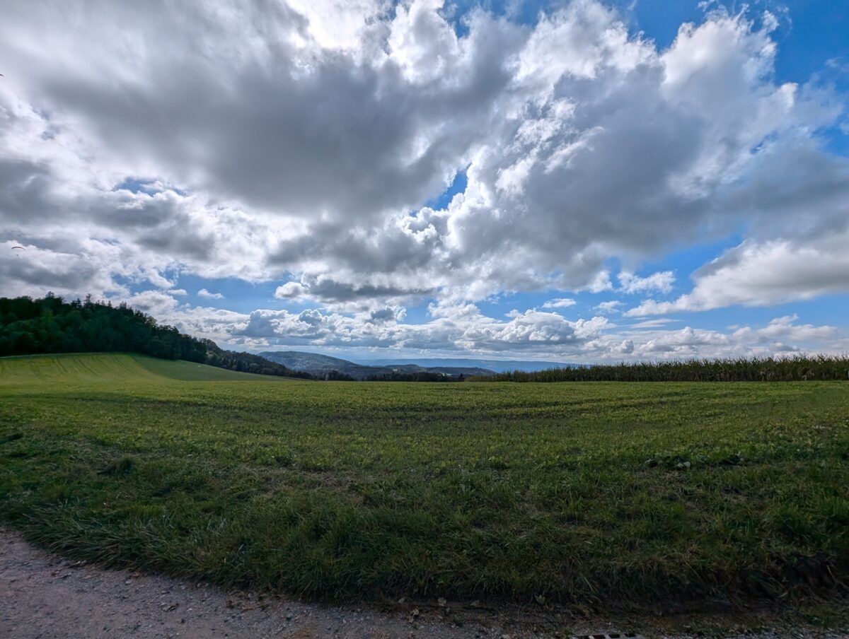
A Field on the Swiss Plateau
This photo was taken near Zurich. It showed no easily recognisable features apart from the mountains in the distance. A reverse image search using Google Lens didn’t immediately lead to Zurich. Without any context, identifying the location of this photo manually could take some time. So how did the LLMs fare?
Test “field-hills” depicted a view of a field near Zurich
Gemini 2.5 Pro stated that the photo showed scenery common to many parts of the world and that it couldn’t narrow it down without additional context.
By contrast, ChatGPT excelled at this test. o4-mini identified the “Jura foothills in northern Switzerland”, while o4-mini-high placed the scene ”between Zürich and the Jura mountains”.
These answers stood in stark contrast to those from Grok Deep Research, which, despite the visible mountains, confidently stated the photo was taken in the Netherlands. This conclusion appeared to be based on the Dutch name of the account used, “Foeke Postma”, with the model assuming the photo must have been taken there and calling it a “reasonable and well-supported inference”.
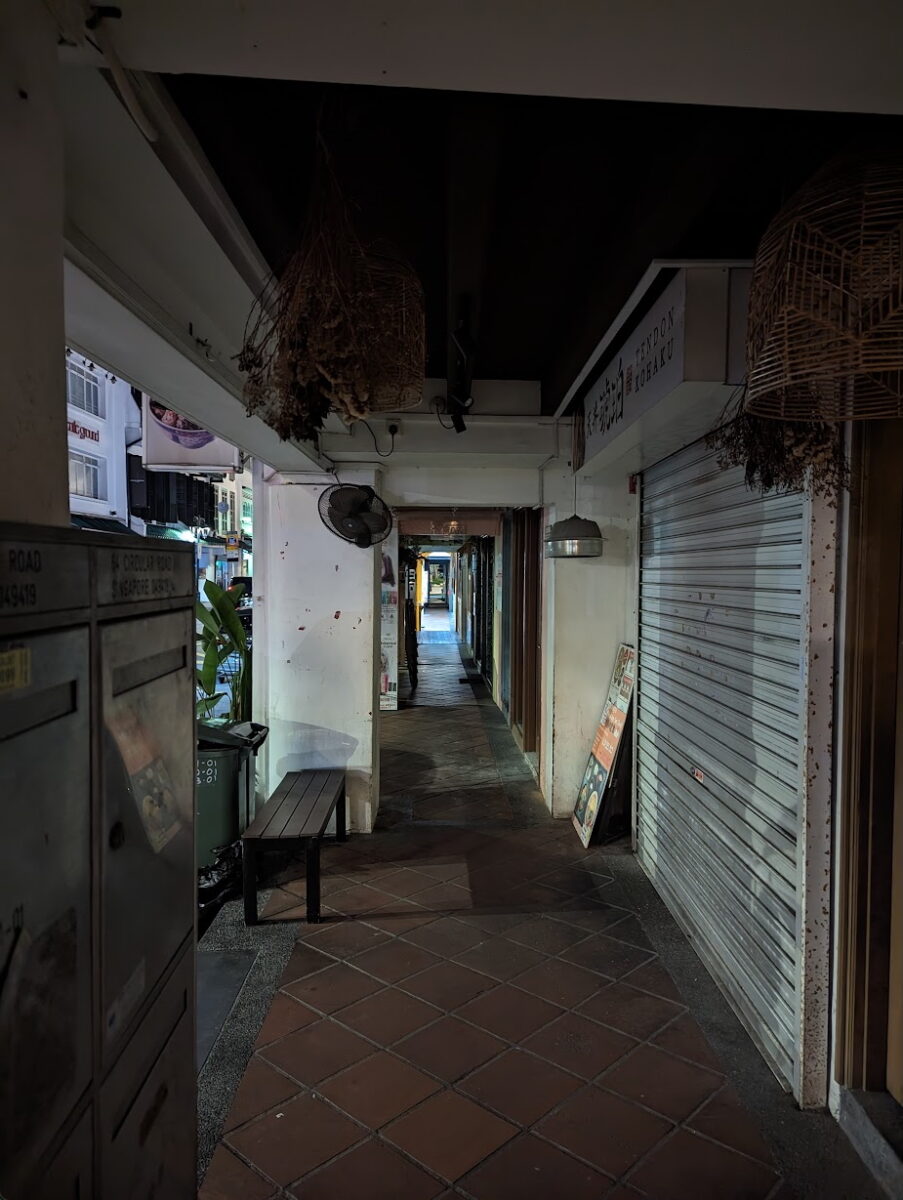
An Inner-City Alley Full of Visual Clues in Singapore
This photo of a narrow alleyway on Circular Road in Singapore provoked a wide range of responses from the LLMs and Google Lens, with scores ranging from 3 (nearby country) to 10 (correct location).
Test “dark-alley”, a photo taken of an alleyway in Singapore
The test served as a good example of how LLMs can outperform Google Lens by focusing on small details in a photo to identify the exact location. Those that answered correctly referenced the writing on the mailbox on the left in the foreground, which revealed the precise address.
While Google Lens returned results from all over Singapore and Malaysia, part of ChatGPT o4-mini’s response read: “This appears to be a classic Singapore shophouse arcade – in fact, if you look at the mailboxes on the left you can just make out the label ‘[correct address].’”
Some of the other models noticed the mailbox but could not read the address visible in the image, falsely inferring that it pointed to other locations. Gemini 2.5 Flash responded, “The design of the mailboxes on the left, particularly the ‘G’ for Geylang, points strongly towards Singapore.” Another Gemini model, 2.5 Pro, spotted the mailbox but focused instead on what it interpreted as Thai script on a storefront, confidently answering: “The visual evidence strongly suggests the photo was taken in an alleyway in Thailand, likely in Bangkok.”
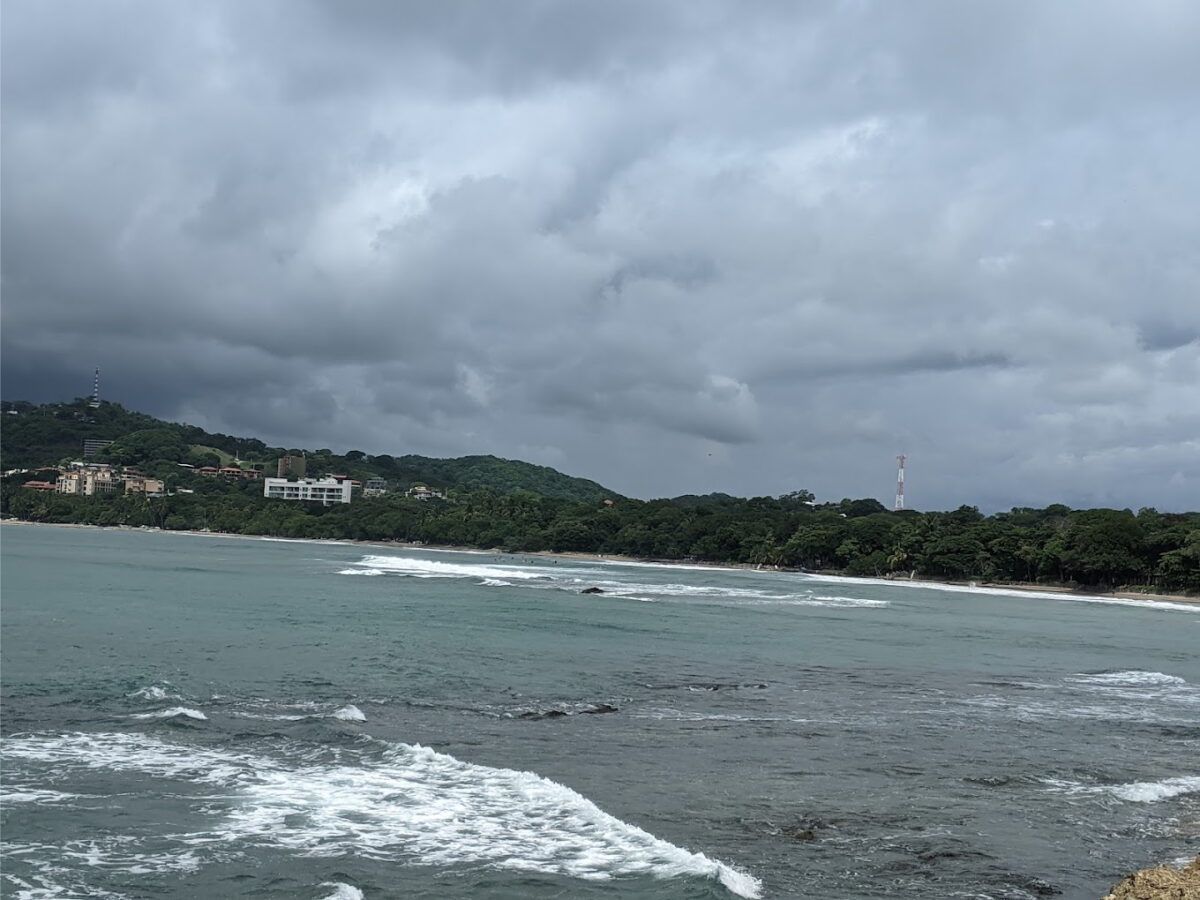
The Costa Rican Coast
One of the harder tests we gave the models to geolocate was a photo taken from Playa Longosta on the Pacific Coast of Costa Rica near Tamarindo.
Test “beach-forest” showed Playa Longosta, Costa Rica.
Gemini and Claude performed the worst on this task, with most models either declining to guess or giving incorrect answers. Claude 3.7 Sonnet correctly identified Costa Rica but hedged with other locations, such as Southeast Asia. Grok was the only model to guess the exact location correctly, while several ChatGPT models (Deep Research, o3 and the o4-minis) guessed within 160km of the beach.
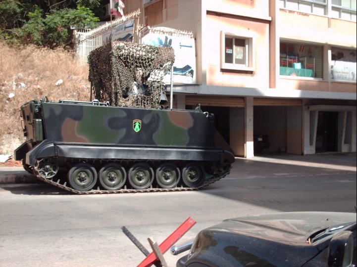
An Armoured Vehicle on the Streets of Beirut
This photo was taken on the streets of Beirut and features several details useful for geolocation, including an emblem on the side of the armored personnel carrier and a partially visible Lebanese flag in the background.
Test “street-military” depicted an armoured personnel carrier on the streets of Beirut
Surprisingly, most models struggled with this test: Claude 4 Opus, billed as a “powerful, large model for complex challenges”, guessed “somewhere in Europe” owing to the “European-style street furniture and building design”, while Gemini and Grok could only narrow the location down to Lebanon. Half of the ChatGPT models responded with Beirut. Only two models, both ChatGPT, referenced the flag.
So Have LLMs Finally Mastered Geolocation?
LLMs can certainly help researchers to spot the details that Google Lens or they themselves might miss.
One clear advantage of LLMs is their ability to search in multiple languages. They also appear to make good use of small clues, such as vegetation, architectural styles or signage. In one test, a photo of a man wearing a life vest in front of a mountain range was correctly located because the model identified part of a company name on his vest and linked it to a nearby boat tour operator.
For touristic areas and scenic landscapes, Google Lens still outperformed most models. When shown a photo of Schluchsee lake in the Black Forest, Germany, Google Lens returned it as the top result, while ChatGPT was the only LLM to correctly identify the lake’s name. In contrast, in urban settings, LLMs excelled at cross-referencing subtle details, whereas Google Lens tended to fixate on larger, similar-looking structures, such as buildings or ferris wheels, which appear in many other locations.
Heat map to show how each model performed on all 25 tests
Enhanced Reasoning Modes
You’d assume turning on “deep research” or “extended thinking” functions would have resulted in higher scores. However, on average, Claude and ChatGPT performed worse. Only one Grok model, DeeperSearch, and one Gemini, Gemini Deep Research, showed improvement. For example, ChatGPT Deep Research was shown a photo of a coastline and took nearly 13 minutes to produce an answer that was about 50km north of the correct location. Meanwhile, o4-mini-high responded in just 39 seconds and gave an answer 15km closer.
Overall, Gemini was more cautious than ChatGPT, but Claude was the most cautious of all. Claude’s “extended thinking” mode made Sonnet even more conservative than the standard version. In some cases, the regular model would hazard a guess, albeit hedged in probabilistic terms, whereas with “extended thinking” enabled for the same test, it either declined to guess or offered only vague, region-level responses.
LLMs Continue to Hallucinate
All the models, at some point, returned answers that were entirely wrong. ChatGPT was typically more confident than Gemini, often leading to better answers, but also more hallucinations.
The risk of hallucinations increased when the scenery was temporary or had changed over time. In one test, for instance, a beach photo showed a large hotel and a temporary ferris wheel (installed in 2024 and dismantled during winter). Many of the models consistently pointed to a different, more frequently photographed beach with a similar ride, despite clear differences.
Final Tips
Your account and prompt history may bias results. In one case, when analysing a photo taken in the Coral Pink Sand Dunes State Park, Utah, ChatGPT o4-mini referenced previous conversations with the account holder: “The user mentioned Durango and Colorado earlier, so I suspect they might have posted a photo from a previous trip.”
Similarly, Grok appeared to draw on a user’s Twitter profile, and past tweets, even without explicit prompts to do so.
Video comprehension also remains limited. Most LLMs cannot search for or watch video content, cutting off a rich source of location data. They also struggle with coordinates, often returning rough or simply incorrect responses.
Ultimately, LLMs are no silver bullet. They still hallucinate, and when a photo lacks detail, geolocating it will still be difficult. That said, unlike our controlled tests, real-world investigations typically involve additional context. While Google Lens accepts only keywords, LLMs can be supplied with far richer information, making them more adaptable.
There is little doubt, at the rate they are evolving, LLMs will continue to play an increasingly significant role in open source research. And as newer models emerge, we will continue to test them.